The Interpretation Framework in Context — Hammer, Engulfing, and Morning Star
Three charts applying the four quality dimensions — location, magnitude, confluence, and confirmation — to patterns in realistic price sequences.
- Apply location, magnitude, confluence, and confirmation to evaluate a hammer signal
- Identify why the same engulfing shape produces different quality scores depending on where it forms
- Read a morning star's three-act structure and assess the third candle's penetration depth
- Explain why textbook-quality signals are rare and what 'strong on all four dimensions' looks like in practice
The interpretation framework in context — hammer, engulfing, morning star
These are fabricated price sequences constructed to illustrate the patterns clearly — not real market data. That's better for teaching, because real charts are noisy and patterns are rarely textbook-clean. For learning, you want the pattern visible enough that students can spot it, then later transition to messier real charts where they have to find it.
Chart 1: Hammer at support, with confirmation
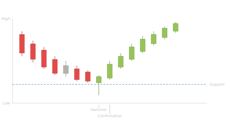
Chart 1: Hammer at support with confirmation — a four-quality-dimension example
This is a four-quality-dimension example. Location is excellent — the hammer forms after a sustained downtrend, not a two-bar dip. Confluence is present — the hammer's low touches a prior support level. Magnitude is reasonable — the lower shadow is roughly twice the body. Confirmation arrives the next session — a strong bullish candle closes well above the hammer's body. All four quality checks pass, and the recovery follows. This is what a textbook-quality signal looks like; most real signals are weaker on at least one dimension.
Chart 2: Bearish engulfing at resistance, followed by reversal
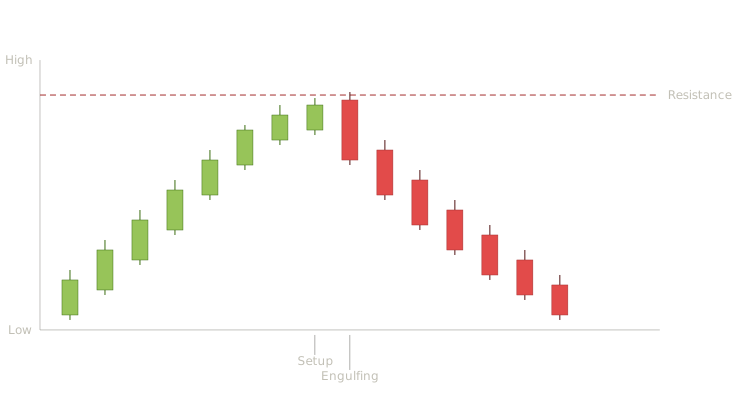
Chart 2: Bearish engulfing at resistance followed by reversal — location and magnitude both strong
Notice how the engulfing pattern's first candle is small and the second is dramatically larger — that's strong magnitude. The pattern forms exactly at the resistance level, giving confluence. Location is good — this comes after a sustained advance, not a brief pop. The next session opens lower and closes lower still, confirming the reversal. Teaching point: an engulfing pattern in the middle of a trend with no resistance overhead is the same shape but a much weaker signal. Same pattern, different quality score.
Chart 3: Morning star at a prior low
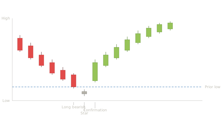
Chart 3: Morning star at a prior low — three-act structure with deep third-candle penetration
The morning star is a three-act structure — establishment, indecision, confirmation. The first candle continues the prevailing decline. The small star body shows that selling pressure has faltered, but doesn't yet prove buyers have taken over. The third candle is the proof: a long bullish candle that closes well into the body of the first candle. Notice the closing point — that's the penetration depth concept from the interpretive layer. A morning star where the third candle barely pokes into the first candle's body is a weak signal; one where it closes near the first candle's open (as here) is much stronger. Also worth pointing out: the star itself is the most important candle to identify correctly. Students often misread a small bullish body as a star when the body is actually too large — at which point what they're looking at isn't a morning star at all, just three random candles. The star must be small relative to the candles bracketing it; that proportion is the pattern's defining feature.
Key Takeaways
- A textbook-quality signal is strong on all four dimensions — location, magnitude, confluence, and confirmation. Most real signals are weaker on at least one.
- Same pattern, different quality score: a bearish engulfing at a resistance level after a sustained advance is materially stronger than the same shape mid-trend with no confluence
- Morning star penetration depth matters: a third candle closing near the first candle's open is much stronger than one barely poking into the first candle's body
- The star in a morning star must be small relative to the candles bracketing it — a body that's too large means it isn't a star, just three random candles
Quiz — 3 Questions
Answer one at a timeThe hammer in Chart 1 passes all four quality checks. If the same hammer shape appeared after a two-bar dip in a sideways range with no nearby support, how many quality dimensions would it pass?