Moving Average Envelopes and Bollinger Bands
Both tools draw channels above and below a moving average to contain most price action — but Bollinger Bands adapt to changing volatility automatically while envelopes use a fixed percentage. Understanding both tools reveals when each is appropriate and how to read the patterns they produce.
- Explain the conceptual difference between moving average envelopes and Bollinger Bands
- Calculate envelope upper and lower bands given a moving average value and deviation percentage
- Calculate Bollinger Band upper and lower bands given an SMA and standard deviation
- Identify the Bollinger squeeze pattern and explain what it signals about upcoming price action
- Distinguish a band walk from a mean-reversion signal at the same upper band touch
- Integrate Bollinger Band readings with candle patterns, chart patterns, and moving averages
The Shared Foundation and the Key Difference
Moving average envelopes and Bollinger Bands are both built on the same conceptual foundation: draw lines above and below a moving average to create a channel that contains most price action. When price moves outside the channel, something unusual is happening — either an exceptionally strong move that may continue, or an extreme that's likely to reverse back toward the moving average. The channel itself becomes an analytical tool that adds dimensions beyond what the moving average alone provides.
The two tools differ in how they calculate the channel's width. Moving average envelopes use a fixed percentage above and below the moving average — the bands are always the same percentage distance from the center line regardless of market conditions. Bollinger Bands use standard deviations of price, which means the bands automatically expand when volatility increases and contract when volatility decreases. This single difference makes Bollinger Bands substantially more popular than envelopes because they adapt to changing market conditions, but envelopes still serve specific purposes that make them worth understanding.
Bollinger Bands in particular are one of the most widely used technical analysis tools in the world. They were developed by John Bollinger in the early 1980s and have become standard equipment for technical traders across all markets and timeframes. Bollinger himself has written extensively about how to use them correctly, and his work emphasizes a specific point that this lesson will reinforce: Bollinger Bands are tools for identifying relative price extremes, not absolute trading signals. Used as standalone trading triggers, they produce mediocre results — the same pattern we've seen with crossovers and moving averages used mechanically. Used within integrated analysis, they add genuine value.
This lesson covers both moving average envelopes and Bollinger Bands together because the underlying concept (channels around a moving average) is shared, even though the specific implementations differ. Readers who understand both will know when each is appropriate and how they relate to each other.
Vocabulary
| Term | Definition |
|---|---|
| Moving average envelope | A channel created by drawing lines a fixed percentage above and below a moving average. The percentage is set by the trader (commonly 2-5%) and remains constant regardless of market conditions. The channel's width depends only on price level, not on volatility. |
| Bollinger Bands | A channel created by drawing lines a specified number of standard deviations above and below a moving average. The standard deviation is calculated from recent price action, which means the bands automatically expand during high-volatility periods and contract during low-volatility periods. Developed by John Bollinger in the 1980s. |
| Standard deviation | A statistical measure of how much price has been varying from its average. Higher standard deviation means more variation (more volatility); lower standard deviation means less variation (less volatility). The mathematical core of why Bollinger Bands adapt to market conditions. |
| Middle band | The moving average that sits in the center of the Bollinger Band channel. The default is the 20-period simple moving average, which has become so standard that 'Bollinger Bands' without other specification almost always means 20-period SMA with bands at 2 standard deviations. |
| Upper band | The line above the moving average. Calculated as the moving average plus the specified number of standard deviations. With default settings, the upper band sits 2 standard deviations above the 20-period SMA. |
| Lower band | The line below the moving average. Calculated as the moving average minus the specified number of standard deviations. With default settings, the lower band sits 2 standard deviations below the 20-period SMA. |
| Band width | The distance between the upper and lower bands at any given moment. Reflects current volatility. Wide bands mean high volatility; narrow bands mean low volatility. The width itself can be tracked as an indicator (Bollinger Bandwidth) for analyzing volatility patterns. |
| Bollinger squeeze | A pattern where the bands contract to unusually narrow widths, indicating exceptionally low volatility. Often precedes significant directional moves because low volatility periods tend to be followed by high volatility periods. The squeeze doesn't predict the direction of the eventual move, only that a meaningful move is likely. |
| %B | A standardized measure of where price sits within the Bollinger Band channel. Calculated as (price - lower band) / (upper band - lower band). Reads 0.0 at the lower band, 0.5 at the middle band, and 1.0 at the upper band. Values above 1.0 mean price is above the upper band; values below 0.0 mean price is below the lower band. |
| Band walk | When price persistently rides along one of the bands during a strong trend. Bullish band walk means price stays near the upper band during an uptrend; bearish band walk means price stays near the lower band during a downtrend. Often misinterpreted as overbought or oversold when it actually signals trend strength. |
| Mean reversion to the middle band | When price has moved to an extreme band and pulls back toward the moving average. The most common Bollinger Band pattern in ranging markets — price touches the upper band, reverses toward the middle band, then touches the lower band, then reverses back toward the middle, in repeating oscillation. |
| Bandwidth | The width of the Bollinger Band channel expressed as a percentage of the middle band. A separate indicator (Bollinger Bandwidth in thinkorswim) that tracks this width over time. Used to identify squeeze conditions and volatility expansion patterns. |
| Keltner Channels | A different volatility-channel system that uses ATR (Average True Range) rather than standard deviation for band width. Conceptually similar to Bollinger Bands but with different mathematical underpinnings. Mentioned here because the platform offers Keltner Channels alongside Bollinger Bands, and the comparison illuminates what Bollinger Bands specifically do. |
| Envelope deviation | The percentage above and below the moving average used to draw envelope bands. Commonly set at 2-5% but customizable to any value. Higher percentages produce wider envelopes that price rarely touches; lower percentages produce narrower envelopes that price touches frequently. |
What the Configuration Settings Actually Mean
When a reader adds Bollinger Bands or moving average envelopes to a chart and opens their settings, they'll see several configurable parameters. Each one affects what the tool is actually measuring.
- Length (or period). The number of bars used to calculate both the moving average and the standard deviation (for Bollinger Bands) or the moving average alone (for envelopes). The default for Bollinger Bands is 20, which has become standard through Bollinger's own recommendation and decades of common use. Shorter periods produce bands that respond more to recent volatility; longer periods produce bands that smooth out short-term volatility changes. Most traders use the 20-period default.
- Number of standard deviations (Bollinger Bands only). How far the upper and lower bands sit from the middle band, expressed in standard deviations. The default is 2, which captures roughly 95% of price action under normal statistical assumptions. Higher values (2.5 or 3) produce wider bands that price rarely touches; lower values (1 or 1.5) produce narrower bands that price touches frequently. The 2 standard deviation default works well for most applications.
- Envelope deviation percentage (envelopes only). How far the upper and lower bands sit from the moving average, expressed as a percentage. Commonly set at 2-5%. The choice depends on the asset and timeframe — volatile stocks need higher percentages, calm assets need lower percentages. Unlike Bollinger Bands' standard deviation approach, this setting requires the trader to manually choose what counts as an 'extreme' distance for the asset being traded.
- Price input. Which price from each bar is used in the calculations. Closing price is the default and works for almost all applications. Some traders experiment with other inputs (high, low, midpoint) but the closing price remains standard.
- Type of moving average (in some implementations). Many platforms allow the middle band to be calculated as an SMA or EMA. Bollinger's original specification used SMA, and most traders still use SMA. EMA-based Bollinger Bands respond faster but lose some of the statistical interpretation that makes Bollinger Bands meaningful.
The Math Behind Moving Average Envelopes
The envelope calculation is straightforward. The upper band is calculated as the moving average multiplied by (1 + envelope deviation), and the lower band is calculated as the moving average multiplied by (1 - envelope deviation).
Upper Envelope
Upper envelope = MA × (1 + d/100)
Lower Envelope
Lower envelope = MA × (1 − d/100)
Where MA is the moving average and d is the envelope deviation percentage.
With a 20-period SMA value of 100 and an envelope deviation of 3%: Upper envelope = 100 × (1 + 0.03) = 100 × 1.03 = 103 Lower envelope = 100 × (1 − 0.03) = 100 × 0.97 = 97 The envelope channel spans from 97 to 103, with a width of 6 points. If the moving average rises to 110, the envelope shifts up but the percentage-based width stays proportionally identical (110 × 1.03 = 113.3 and 110 × 0.97 = 106.7). The envelope doesn't respond to changes in volatility, which is its main limitation.
Moving average envelopes work best when volatility is relatively stable. They identify percentage-based extremes from the moving average that can serve as mean-reversion references. Their fixed-percentage construction makes them simple to understand and easy to backtest. They're less popular than Bollinger Bands because most markets don't have stable volatility, but they remain in the toolkit for specific applications where their simplicity is valuable.
The Math Behind Bollinger Bands
Bollinger Bands use standard deviations instead of fixed percentages, which makes the calculation more involved but produces bands that adapt to current market conditions.
Middle Band
Middle band = SMA(price, period)
Upper Band
Upper band = SMA + (multiplier × standard deviation)
Lower Band
Lower band = SMA − (multiplier × standard deviation)
Where standard deviation is calculated across the same period as the moving average, and multiplier is typically 2.
Standard deviation calculation. For each bar in the period, calculate the difference between that bar's price and the moving average. Square these differences (which makes them all positive). Sum the squared differences. Divide by the period length. Take the square root of the result. This gives the standard deviation. The mathematical detail is what makes Bollinger Bands special: the standard deviation responds to how much price has been varying from its average. If recent bars have been close to the moving average (low variation), the standard deviation is small and the bands are narrow. If recent bars have been far from the moving average (high variation), the standard deviation is large and the bands are wide.
Suppose the 20-period SMA is 100, and the standard deviation of the last 20 bars' prices around that SMA is 5. With a multiplier of 2: Upper band = 100 + (2 × 5) = 100 + 10 = 110 Lower band = 100 − (2 × 5) = 100 − 10 = 90 The bands span from 90 to 110, with a width of 20 points. Now suppose the next 20 bars are calmer. The new SMA is 102, but the standard deviation drops to 2. With a multiplier of 2: Upper band = 102 + (2 × 2) = 102 + 4 = 106 Lower band = 102 − (2 × 2) = 102 − 4 = 98 The bands now span from 98 to 106, with a width of only 8 points. The bands contracted because volatility decreased, even though the underlying price level shifted only slightly. This is the adaptive feature that makes Bollinger Bands so useful.
Under normal distribution assumptions, roughly 95% of price action stays within ±2 standard deviations of the mean. This means Bollinger Bands with default settings should contain about 95% of price action, with about 5% of bars touching or exceeding the bands. This statistical interpretation is what makes Bollinger Bands meaningful — they're not arbitrary lines but rather statistically grounded boundaries that identify when price has moved into unusual territory. The same adaptive math that responds to volatility changes also means the bands automatically widen during high-volatility periods and contract during low-volatility periods, keeping the statistical interpretation valid across different market conditions.
The Bollinger Squeeze
The Bollinger squeeze is one of the most important patterns Bollinger Bands reveal. When the bands contract to unusually narrow widths, the squeeze pattern emerges. The narrow bands indicate exceptionally low volatility, which historically tends to be followed by exceptionally high volatility.
Why squeezes precede directional moves. Markets tend to alternate between low-volatility consolidation periods and high-volatility directional periods. During consolidation, price oscillates within tight ranges and the bands contract. The consolidation eventually resolves when price breaks out of the range, and the breakout typically produces sustained directional movement.
The squeeze itself doesn't predict the direction of the eventual breakout. A stock can squeeze and then break upward or downward — the squeeze pattern is direction-agnostic. What it does predict is that a directional move is becoming increasingly likely as the consolidation extends. The longer the squeeze persists, the larger the eventual breakout tends to be.
How to identify a squeeze. Visually, a squeeze looks like a noticeable narrowing of the band channel. The bands come close together, creating a tight channel that price oscillates within. Some traders measure squeezes quantitatively using the Bollinger Bandwidth indicator (a separate study in thinkorswim) which tracks the band width over time. When the bandwidth reaches its lowest values in recent history, a squeeze is in effect.
Trading the squeeze. The common approach is to wait for the breakout rather than trading the squeeze itself. When price breaks decisively above the upper band or below the lower band during or just after a squeeze, the breakout direction is taken as a signal. This requires patience because squeezes can persist for extended periods before resolving, and traders who jump in too early often get caught in continued consolidation.
The TTM Squeeze indicator in thinkorswim is a popular tool specifically built around the squeeze concept. It combines Bollinger Bands with Keltner Channels to identify squeeze conditions more precisely. The basic Bollinger squeeze concept underlies it.
Band Walks: When Price Rides the Bands During Trends
Many beginning traders misunderstand what it means when price touches or exceeds a Bollinger Band. The conventional interpretation — that touching the upper band means overbought and touching the lower band means oversold — is correct in ranging markets but wrong in trending markets. In strong trends, price routinely rides one of the bands for extended periods, and this band walk pattern signals trend strength rather than reversal.
The bullish band walk. During strong uptrends, price often touches the upper band, pulls back slightly to the middle band, then advances back to the upper band, and so on in a pattern that walks the upper band as the trend progresses. The middle band (the 20-period SMA) acts as dynamic support — pullbacks find support there and the trend continues. A trader who shorts every touch of the upper band during a bullish band walk takes repeated losses because the trend keeps making new highs.
The bearish band walk. The inverse. During strong downtrends, price touches the lower band, rallies briefly to the middle band, then declines back to the lower band, and so on. The middle band acts as dynamic resistance for the bearish band walk. A trader who buys every touch of the lower band during a bearish band walk takes repeated losses because the trend keeps making new lows.
This is the most important skill for using Bollinger Bands effectively. The same price touching the upper band can mean different things depending on context. In a ranging market, the touch suggests reversal back to the middle. In a trending market, the touch suggests trend continuation. Reading the broader context — chart pattern structure, candle character, moving average slope, ADX or other trend-strength indicators — is what tells the trader which interpretation applies.
John Bollinger has been explicit that the bands are not standalone overbought/oversold indicators. He has written that traders should always integrate Bollinger Bands with other analysis rather than treating band touches as autonomous signals. The integration principle we've been emphasizing throughout the technical analysis section is exactly what Bollinger himself recommends.
Reading Bollinger Bands in Context
Several specific reading habits make Bollinger Bands useful as supplements to the price action analysis the curriculum has built.
- Band width as volatility measure. Beyond just the position of price relative to the bands, the width of the channel itself is informative. Wide bands signal high volatility; narrow bands signal low volatility. Volatility tends to cycle between high and low states, so extreme readings in either direction often precede transitions to the other state.
- Middle band as dynamic support and resistance. The 20-period SMA in the middle of the channel functions exactly like any moving average. In uptrends, it provides dynamic support that pullbacks often respect. In downtrends, it provides dynamic resistance that rallies often respect. The moving average reading habits from Lessons 30 and 31 transfer directly to the middle band.
- Band touches as reference points. When price reaches the upper band, the trader should ask: 'What's the broader context?' In a ranging market with no trend, the upper band touch is likely a mean reversion signal. In a strong uptrend with bullish chart pattern context, the upper band touch is likely trend continuation. The bands provide a reference point for asking the question, but the answer depends on the broader analysis.
- %B as a position indicator. The %B value tells the trader where price sits within the channel as a single number. %B above 1.0 means price is outside the upper band; %B below 0.0 means price is outside the lower band. Many traders find %B easier to interpret than visually estimating price position relative to the bands, especially when scanning multiple charts.
- Band penetration combined with candle signals. A bullish reversal candle (hammer, bullish engulfing, morning star) appearing at the lower band creates higher-conviction entry than the same candle in random price space. A bearish reversal candle at the upper band creates higher-conviction exit or short entry. The integration of band position with candle patterns is one of the most useful applications of Bollinger Bands within the integrated framework.
Pattern Statistics and Sources
Liberated Stock Trader's 360 years of backtesting found that Bollinger Bands' best setting is SMA 20 with 2 standard deviations on a 60-minute chart, producing a 47% win rate compared to buy-and-hold. Testing of the three main Bollinger Band strategies showed an average success rate of only 33% across various applications, with 53% of Dow Jones 30 stocks returning losses using a standard Bollinger Bands strategy.
Independent backtesting of Bollinger Bands Squeeze Breakout strategies across 6 different assets and 2 timeframes generated over 2,000 trades, with the strategy profitable in 7 out of 12 backtest runs. Win rates ranged from 26.7% to 44.3%, with up to 14 consecutive losses occurring in some runs. The strategy performed substantially better on daily timeframes than hourly timeframes for breakout applications.
QuantifiedStrategies' research on Bollinger Bands combined with MACD found that the combined strategy produced a 78% win rate on the semiconductor ETF (SMH) with an average return of 1.4% per trade after commissions and slippage and a relatively low maximum drawdown of 15%. The combined approach substantially outperformed Bollinger Bands alone, demonstrating the value of multi-indicator confluence.
Forex-specific research on Bollinger Bands indicates that combined strategies (Bollinger Bands with MACD or other indicators) can improve win rates to approximately 55% compared to Bollinger Bands used alone with 33-47% win rates. The research emphasizes that Bollinger Bands alone produce too many false signals without additional confirmation, and that integrating them with momentum or volume analysis substantially improves reliability.
The published research is consistent on several points. Bollinger Bands used as standalone trade signals produce mediocre results (win rates around 33-47%). This is the same pattern we've seen with moving averages and crossovers — mechanical use of any single indicator produces poor results across most market conditions. The result improves significantly when Bollinger Bands are combined with other tools — momentum indicators like MACD, trend confirmation, candle pattern confluence, chart pattern context. The research also confirms a specific Bollinger Band finding: longer timeframes produce better signal reliability than shorter timeframes. The 60-minute timeframe Liberated Stock Trader identified and the daily timeframe that works better for breakouts both reflect the broader principle that Bollinger Bands work better when there's enough time between price movements for the bands to meaningfully adjust. The honest interpretation: Bollinger Bands are useful tools within integrated analysis, not autonomous trading systems.
- bollingerbands.com — John Bollinger's official site with the developer's own documentation and recommendations, including his book 'Bollinger on Bollinger Bands'
- liberatedstocktrader.com — Extensive backtested research with specific reliability figures
- quantifiedstrategies.com — Methodology-focused research including combined strategies
- quant-signals.com — Recent backtesting across multiple markets and timeframes
- Academic literature via Google Scholar — Search 'Bollinger Bands,' 'volatility bands,' 'standard deviation channels'
Common Student Mistakes with Bollinger Bands
- Treating band touches as automatic reversal signals. The most common mistake. Touching the upper band doesn't automatically mean overbought; touching the lower band doesn't automatically mean oversold. In trending markets, price routinely touches one band while the trend continues. Context matters more than the mechanical band touch.
- Ignoring the band walk pattern. Strong trends produce band walks where price persistently rides one band. Traders who fade every band touch during a band walk take repeated losses. Recognizing band walks and adjusting strategy accordingly is essential.
- Using Bollinger Bands as standalone signals. The research is consistent: standalone Bollinger Band signals produce 33-47% win rates. Combined with other tools, win rates improve to 55%+ or higher depending on the combination. Bollinger Bands are confluence tools, not autonomous triggers.
- Optimizing settings to fit historical data. The temptation is to test various period and standard deviation combinations until one produces good backtest results. This curve-fitting approach typically produces worse results in live trading because the optimized settings reflect historical noise rather than genuine signal. The standard 20-period and 2 standard deviation settings exist for good reasons; deviating from them should require specific justification.
- Missing the squeeze pattern. Squeeze patterns are among the most useful Bollinger Band signals, but many traders watch for band touches without watching for band contractions. The squeeze provides advance notice that volatility is about to expand, which is valuable information even before the eventual breakout direction is clear.
- Trading the squeeze too early. When a squeeze develops, the temptation is to enter immediately in anticipation of the breakout. This often produces losses because squeezes can persist for extended periods before resolving. The disciplined approach is to wait for the actual breakout — a decisive close beyond one of the bands — before entering.
- Confusing Bollinger Bands with Keltner Channels. Both are volatility-based channels around a moving average, but they use different mathematics (standard deviation versus ATR) and produce different signals. The TTM Squeeze indicator specifically uses both together because they're complementary, but treating them as interchangeable is a category error.
- Using the wrong moving average type. John Bollinger's original specification uses SMA. Some traders substitute EMA, which changes the bands' statistical interpretation. EMA-based 'Bollinger Bands' aren't really Bollinger Bands in the original sense — they're a different tool that happens to look similar. Use SMA unless you have specific reasons to use EMA and you understand what that substitution changes.
- Treating %B above 1.0 or below 0.0 as guaranteed reversal points. Price exceeding the bands happens regularly even in healthy trends. The signal value is in the context — exceeding the upper band during a confirmed uptrend often signals continuation; exceeding it during a ranging market often signals reversal. The %B value alone doesn't determine which interpretation applies.
Reading Bollinger Bands Integrated with Prior Lessons
The integrated chart for this lesson follows the progressive integration principle established in the prior lesson. The chart includes candle patterns from the early lessons, a chart pattern from the 14-28 range, moving averages and crossovers from Lessons 30-32, and now Bollinger Bands as the new tool from Lesson 33.
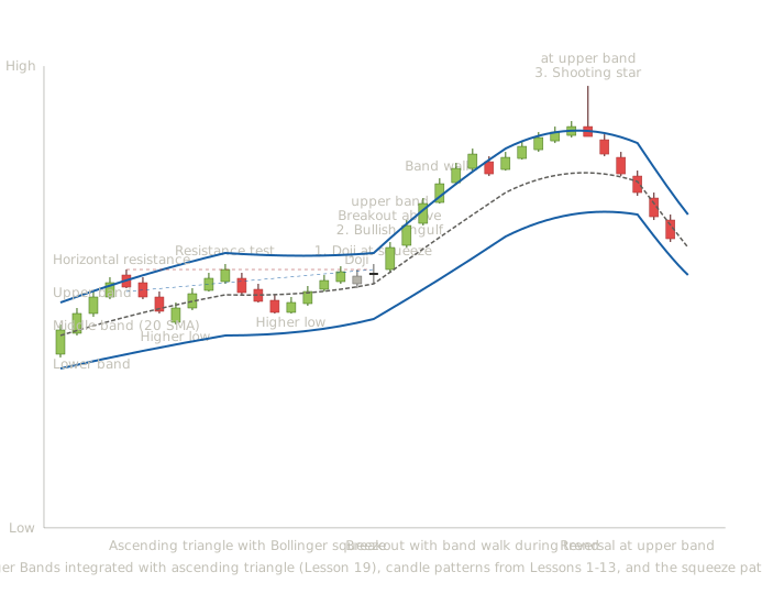
Ascending triangle (Lesson 19) with Bollinger squeeze, doji at squeeze peak, bullish engulfing breakout, band walk, and shooting star reversal — progressive integration of candle patterns, chart patterns, and Bollinger Bands
This chart shows what the integrated reading looks like with Bollinger Bands added. The chart includes an ascending triangle pattern from Lesson 19, three named candle patterns from Lessons 1-13 (doji, bullish engulfing, shooting star), and the Bollinger Band system with its three lines and characteristic patterns.
The ascending triangle development (candles 1-19). The ascending triangle from Lesson 19 forms with horizontal resistance at the top and rising support along the bottom. Notice that as the triangle develops, the Bollinger Bands progressively contract toward each other. This is the squeeze pattern — the bands are narrowing because volatility is decreasing as price consolidates within the triangle. The squeeze visualizes what the triangle structurally represents: a period of decreasing volatility before a directional resolution. The triangle pattern and the Bollinger squeeze are showing the same underlying phenomenon from different analytical perspectives. The chart pattern reading focuses on the structural geometry (horizontal resistance, rising support, converging trendlines). The Bollinger Band reading focuses on the volatility compression (narrowing bands). Both perspectives are correct, and both signal that a meaningful breakout is approaching.
Signal 1 — Doji at the squeeze (candle 20). A doji forms at the tip of the triangle with the Bollinger Bands at their narrowest contraction. From Lesson 2, the doji represents pure indecision. From the squeeze concept, the bands are showing minimum volatility. The doji at the squeeze is signaling that the consolidation has reached its equilibrium point — neither side has momentum, and the next directional move will likely be the resolution. This is the kind of multi-layer signal the integrated framework produces. The chart pattern shows an ascending triangle (Lesson 19), the candle pattern shows a doji at indecision (Lesson 2), and the volatility tool shows a squeeze (Lesson 33). Three independent analytical layers all pointing at the same conclusion: a directional breakout is imminent.
Signal 2 — Bullish engulfing at the breakout (candle 21). A long bullish candle drives price decisively above both the triangle's resistance and the upper Bollinger Band. From Lesson 5, this is the bullish engulfing pattern. From Lesson 19, this is the triangle's structural breakout. From the Bollinger Band perspective, this is the squeeze's directional resolution — and the resolution is bullish. The breakout above the upper Bollinger Band is itself a significant signal. Under normal statistical assumptions, only about 5% of price action exceeds 2 standard deviations from the mean. When price breaks above the upper band, it's a statistical anomaly that signals either an extreme that will reverse or the beginning of a strong directional move. In this context — coming out of a squeeze, breaking out of a chart pattern, confirmed by a powerful bullish candle — the upper band break signals the beginning of a strong trend rather than a reversal.
The band walk during the uptrend (candles 22-29). Eight bullish candles drive price progressively higher. Notice that price rides along the upper band throughout the rally — pulling back briefly toward the middle band, then advancing back to the upper band, in a repeating pattern. This is the band walk. Each touch of the upper band during a band walk is NOT a reversal signal — it's a trend continuation signal. A trader who didn't understand band walks would have shorted at the first upper band touch after the breakout, taken a loss, shorted again at the next touch, taken another loss, and so on across the rally. A trader who understood band walks would have held their long position from the breakout entry and possibly added to it on each pullback to the middle band (which acts as dynamic support during the band walk). Notice the small bearish candle around candle 26 followed immediately by continued bullish candles. This kind of brief pullback that doesn't bring price down to the middle band represents minor profit-taking within the trend. The trend itself is intact because price didn't lose its connection to the upper band.
Signal 3 — Shooting star at the upper band (candle 30). A shooting star forms at what becomes the rally's peak. From Lesson 3, the candle is the reversal signal. From Lesson 30, this is also occurring at extended distance from the middle band (the 20-period SMA), which amplifies the mean-reversion signal. From this lesson's Bollinger Band perspective, the shooting star at the upper band combined with extreme distance from the middle band is signaling that the band walk is ending and mean reversion is likely. This is the key distinction this chart teaches. A band touch during a band walk means continuation. A band touch combined with a reversal candle pattern and extreme distance from the middle band means potential reversal. The same band touch carries different meanings depending on the candle pattern and broader context that accompanies it.
The pullback to the middle band (candles 31-35). Five bearish candles drive price down toward the middle band. The shooting star's prediction has been validated. Price is reverting toward the moving average as the band walk's accumulated extension corrects. The Bollinger Bands are starting to widen again because the price action is now more volatile than during the band walk.
The Bollinger squeeze and the chart pattern consolidation show the same thing from different angles. When an ascending triangle, descending triangle, rectangle, flag, or other consolidation pattern forms, the Bollinger Bands will typically squeeze during the consolidation. The two analytical perspectives reinforce each other — readers can identify the same situation through either the chart pattern lens or the Bollinger Band lens, and the agreement strengthens conviction.
Breakouts above or below the bands gain meaning from context. A breakout above the upper band during a squeeze resolution at the end of a chart pattern is structurally meaningful. A breakout above the upper band during random price action in a ranging market is statistical noise. The same band breakout means different things depending on what's happening structurally.
Band walks distinguish trending markets from ranging markets. The presence of a band walk is itself diagnostic information. If price is riding one band consistently, the market is trending. If price is oscillating between bands without persisting at either extreme, the market is ranging. The same Bollinger Band setup tells the trader which kind of market they're in, which determines which strategy is appropriate.
Reversal signals at band extremes combine multiple analytical layers. A reversal candle pattern (shooting star, evening star, bearish engulfing) at the upper band with extended distance from the middle band combines candle analysis, moving average analysis (the middle band as dynamic reference), and volatility analysis (the upper band as statistical extreme). When all three layers align, the reversal signal is substantially more reliable than any single layer alone.
Making Trading Decisions with Bollinger Bands in Real Time
During the ascending triangle development. The trader sees the chart pattern forming and the Bollinger Bands squeezing. No specific entry signal yet — the triangle hasn't resolved and the squeeze hasn't broken. The appropriate action is to monitor and prepare for the eventual resolution rather than try to trade within the consolidation. Traders who try to trade within squeezes typically lose money because the price action within a squeeze is by definition low-volatility and choppy. The profitable trades come from the breakout, not from trying to trade the consolidation itself.
At the doji at the squeeze (signal 1). The doji at the squeeze suggests a directional resolution is imminent, but doesn't tell the trader which direction. This is a preparation signal more than an entry signal. The trader might set entry alerts above the triangle's resistance and below its support to be notified when the breakout direction becomes clear. Some aggressive traders take small positions in the direction the chart pattern suggests is likely (in this case, the ascending triangle typically resolves to the upside, so a long bias). But the conservative approach is to wait for the actual breakout rather than anticipate it.
At the bullish engulfing breakout (signal 2). This is the high-conviction entry. Multiple analytical layers align: ascending triangle breakout (Lesson 19 chart pattern), bullish engulfing candle (Lesson 5 candle pattern), upper Bollinger Band breakout (statistical extreme indicating strong move), and squeeze resolution (volatility expansion confirming directional move). Position size should reflect the high confluence. Stop placement: below the triangle's support, or below the breakout candle's low, depending on the trader's risk tolerance. The tight stop is justified because the breakout's failure would clearly invalidate the trade — if price returns below the resistance, the breakout was false.
During the band walk (candles 22-29). This is where understanding the band walk pattern matters. A trader who misreads the upper band touches as overbought reversal signals would exit prematurely and miss most of the trend. The integrated trader recognizes the band walk, holds the position, and possibly adds on the pullbacks to the middle band (which acts as dynamic support during the band walk). The decision rule during a band walk: hold the position as long as price keeps making new highs while staying connected to the upper band. Tighten stops as the trend extends, using the middle band as a dynamic stop reference. Exit only on signals that the band walk is ending.
At the shooting star at the upper band (signal 3). This is the exit signal. The combination of reversal candle pattern, extended distance from middle band, and continued upper band position signals that the band walk is exhausting and mean reversion is likely. Take profits or exit fully depending on personal methodology.
What actually happens. Price reverts toward the middle band as the chart shows. The trader who took the signal captures the trend's main move and avoids the pullback. The trader who held hoping for more gains watches profits erode. The systematic discipline of taking signals at confluence is what produces consistent results over time, even though individual signals don't always produce optimal outcomes.
The shooting star at the upper band with extended distance is a high-quality exit signal, but it's not guaranteed to mark the absolute peak. Sometimes price pulls back briefly and then continues higher; sometimes it reverses substantially as this chart shows. Either way, taking the signal is the right action because the alternative — ignoring high-quality signals hoping for more upside — produces worse outcomes on average than systematically taking confluence signals. The shooting star at extended distance is a high-quality exit signal because of the integrated reading — not every individual instance produces the best possible outcome, but the signal class as a whole produces better outcomes than ignoring it.
How This Lesson Connects to What Comes Next
Lesson 34 begins the coverage of momentum oscillators with the Relative Strength Index (RSI). Momentum oscillators are a fundamentally different category of indicator than what we've covered so far. Moving averages and their extensions (envelopes, Bollinger Bands) measure where price has been on average. Momentum oscillators measure how fast price is changing — the rate of change rather than the level or the volatility.
The two categories provide complementary information that integrated traders use together. A moving average tells you whether price is in an uptrend; an oscillator tells you whether that uptrend is accelerating or decelerating. A Bollinger Band tells you whether price is at a statistical extreme; an oscillator tells you whether momentum is supporting that extreme or contradicting it. The combination of trend tools and momentum tools is what most integrated strategies use.
By the time readers complete the momentum oscillator lessons (Lessons 34, 35, and 36), they'll have a complete framework that includes price action analysis (candles and chart patterns), trend tools (moving averages and their extensions), and momentum tools (RSI, MACD, Stochastic, CCI, Williams %R). Each subsequent lesson continues to build the progressive integration that's been the curriculum's central pedagogical approach.
Key Takeaways
- Envelopes use fixed percentage channels; Bollinger Bands use standard deviation channels that automatically adapt to changing volatility — this adaptive quality makes Bollinger Bands substantially more useful in most markets
- The Bollinger squeeze (bands contracting to narrow widths) signals that low volatility is likely to be followed by high volatility — it doesn't predict direction, only that a significant move is approaching
- Band walks are a trending-market pattern where price persistently rides one band — interpreting these as overbought/oversold produces repeated losses; they signal trend strength, not reversal
- 2 standard deviations from the mean contains roughly 95% of price action under normal distribution assumptions — band penetrations are statistical extremes, not random occurrences
- Standalone Bollinger Band signals produce 33-47% win rates; combined strategies with momentum or trend indicators improve to 55-78% — the bands work as confluence tools, not autonomous signals
- John Bollinger's own guidance: always integrate Bollinger Bands with other analysis rather than treating band touches as autonomous signals
Quiz — 3 Questions
Answer one at a timeA stock is in a strong uptrend. Price reaches the upper Bollinger Band and a trader immediately shorts, expecting the overbought level to produce a reversal. The next eight bars continue higher, each one touching the upper band. What is the trader experiencing, and what did they misunderstand?
In this lesson
400 — Technical Indicators — Integration and Methodology