Multi-Indicator Confluence and the Integration Framework
Different indicator categories provide genuinely different kinds of information. When trend tools, momentum tools, volatility tools, volume tools, and structural levels all agree, the resulting signal has multi-dimensional support that no single dimension could provide. This lesson synthesizes the complete analytical framework.
- Name and describe all seven dimensions of the integrated analytical framework
- Distinguish genuine confluence (independent information from different categories) from indicator soup (same information repeated)
- Describe the minimum effective toolkit and explain why more tools doesn't mean better analysis
- Apply the confluence checklist systematically to evaluate a potential trade setup
- Explain how to resolve disagreements between analytical dimensions without ignoring the conflict
- Describe the hierarchy of dimensions — which carry more weight when dimensions conflict
Synthesizing Everything We've Covered
The technical analysis tools section has now covered the major indicator categories: moving averages and their variants (Lessons 30-32), volatility tools (Lesson 33), momentum oscillators (Lessons 34-36), volume tools (Lesson 37), trend strength tools (Lesson 38), and Fibonacci drawing tools (Lessons 39-40). Each lesson explained what its tools do, how they work, when they're appropriate, common mistakes that destroy traders who use them mechanically, and how to integrate them with the broader analytical framework.
This lesson synthesizes all that material. Multi-indicator confluence is the practice of using multiple tools from different categories together to produce higher-conviction trade decisions. The integration framework provides a systematic approach to combining the tools rather than randomly stacking indicators.
The conceptual insight that makes confluence powerful: different indicator categories provide different kinds of information. Trend tools tell you the direction. Momentum tools tell you the speed of price change. Volatility tools tell you how much price is moving. Volume tools tell you the conviction behind the moves. When all these dimensions agree, the resulting signal has multi-dimensional support that no single dimension could provide. The corresponding insight that limits confluence: more isn't automatically better. Adding more indicators within the same category (multiple momentum oscillators, multiple trend indicators) doesn't add genuine confluence — those tools are measuring similar things and will usually agree. Confluence requires independent information from different analytical dimensions.
The Seven Dimensions of Integrated Analysis
The complete analytical framework the curriculum has built has seven distinct dimensions, each providing independent information.
- Dimension 1: Trend context. Where is price relative to its longer-term direction? Moving averages, especially the 50 and 200 SMA from Lesson 30, provide this. ADX from Lesson 38 confirms whether the trend is strong enough to be tradeable. The trend context determines which strategies are appropriate: trend-following in strong trends, mean reversion in ranges.
- Dimension 2: Chart pattern structure. Has price formed any of the structural patterns from Lessons 14-28? Reversal patterns at trend extremes, continuation patterns within trends, and the broader pattern context provide structural reference for what should happen next.
- Dimension 3: Candle pattern timing. Are any of the named candle patterns from Lessons 1-13 appearing at structurally significant moments? Candle patterns provide timing precision within broader chart patterns.
- Dimension 4: Momentum. Is the momentum supporting or contradicting the apparent direction? RSI, MACD, and the other oscillators from Lessons 34-36 measure this. Divergences are particularly valuable for identifying trend exhaustion before price reflects it.
- Dimension 5: Volume. Is broad market participation supporting the moves? OBV, MFI, and VWAP from Lesson 37 provide volume context. Volume confirmation strengthens signals; volume divergence weakens them.
- Dimension 6: Volatility. Is the market currently expanding or contracting in its price ranges? Bollinger Bands from Lesson 33 measure this. Volatility expansion often accompanies sustained trends; volatility contraction (squeezes) often precedes directional moves.
- Dimension 7: Structural levels. Where are the meaningful horizontal and Fibonacci levels? Support, resistance, and Fibonacci retracements/extensions from Lessons 15, 39, and 40 provide reference points for both entries and targets.
A trade decision that aligns with multiple dimensions has confluence. A trade decision that conflicts across dimensions lacks confluence regardless of how compelling any single dimension looks.
The Minimum Effective Toolkit
While the curriculum has covered many tools, working traders rarely use all of them. The minimum effective toolkit — the smallest set of tools that provides multi-dimensional analysis — typically includes:
- One trend tool: usually moving averages (often 20 and 50 SMA together, or 50 and 200 for longer timeframes)
- One momentum tool: usually RSI or MACD, rarely both because they overlap substantially
- One volatility tool: Bollinger Bands is the most common choice
- One volume tool: OBV for divergence detection, or VWAP for intraday work
- One trend strength filter: ADX for regime identification
- Chart pattern recognition: from the price action analysis in Lessons 14-28
- Candle pattern recognition: from Lessons 1-13
- Structural levels: drawn manually as horizontal support/resistance with Fibonacci added for major swings
This toolkit provides coverage across all seven dimensions without the indicator soup of stacking redundant tools. Most successful traders use roughly this set, with personal variations based on their specific trading style.
The Confluence Checklist
When evaluating a potential trade setup, work through this checklist systematically. A trade with strong confluence will check positively across multiple dimensions; a trade with weak confluence will show mixed or conflicting signals.
- Trend check. Is price above or below its 50 SMA? Is the 50 SMA above or below the 200 SMA? Is ADX above 25 (trending) or below (ranging)? What does the trend context suggest about appropriate strategy?
- Structure check. Is there a recognizable chart pattern forming? At what stage of the pattern is price currently? What does the pattern's typical resolution suggest?
- Candle check. Is there a named candle pattern at the current bar or recent bars? What is the candle pattern's typical interpretation at this structural location?
- Momentum check. What is the RSI or MACD reading? Are there any divergences between momentum and price? Does momentum support or contradict the trade direction?
- Volume check. Is OBV moving in the same direction as price, or diverging? If using VWAP for intraday analysis, where is price relative to VWAP? Is volume expanding on moves in the trade's direction?
- Volatility check. Where are the Bollinger Bands? Is there a squeeze pattern developing? Is price at one of the band extremes?
- Level check. Is price at or near a structural level (horizontal support/resistance, Fibonacci retracement or extension, moving average)? Does the level have confluence from multiple sources?
A trade that scores positively across most or all of these checks has high confluence. A trade that scores positively on one or two but conflicts on others has weak confluence and should be approached with reduced conviction.
When Dimensions Disagree
Real trading constantly involves disagreement between dimensions. The trend may be bullish while momentum is showing bearish divergence. Volume may be expanding while Bollinger Bands are squeezing. Chart patterns may suggest continuation while candle patterns suggest reversal. How to handle these disagreements is what separates effective integrated analysis from confused indicator soup.
Hierarchy of dimensions. Not all dimensions carry equal weight. Generally, structural levels and chart patterns are more important than momentum oscillators (because the structure tells you what's possible; oscillators tell you what's currently happening). Trend context is more important than any single signal (because the trend determines what kind of signal to trust). Candle patterns at structural moments are more important than candle patterns in random locations (because the structural moment provides the reason to take the signal seriously).
When dimensions conflict, the conservative approach is to reduce position size or skip the trade. A high-conviction setup requires multiple dimensions agreeing; mixed signals suggest waiting for better setups. Traders who force trades during conflicts typically produce worse results than traders who wait for clearer setups.
Disagreement between dimensions sometimes provides valuable information rather than just confusion. Bullish trend with bearish momentum divergence might warn of approaching trend exhaustion. Bullish chart pattern with bearish volume confirmation might suggest the pattern will fail. Reading these conflicts as warnings rather than ignoring them can prevent losses.
Building Toward Personal Methodology
The integration framework is general — it applies to any trader regardless of style. But effective trading requires personal methodology — specific rules adapted to the individual's risk tolerance, time availability, capital base, and psychological profile. The next lesson covers how to translate the general framework into personal methodology.
Comprehensive Multi-Dimensional Analysis Example
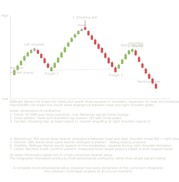
Head and shoulders top with all seven analytical dimensions: trend context (50 SMA flattening), chart pattern structure, candle timing (shooting star at head, bearish engulfing at right shoulder), momentum divergence, volume divergence, volatility cycle, and structural levels — the complete multi-dimensional integration framework
Reading the complete multi-dimensional analysis
This chart demonstrates what working analysis looks like when all seven dimensions of the integration framework are applied simultaneously. The chart shows a head and shoulders top with structural elements at every analytical layer the curriculum has built.
Dimension 1 — Trend context. The 50 SMA was rising during the early uptrend and through the left shoulder formation. As the pattern develops, the 50 SMA flattens — signaling that the broader trend's strength is fading. By the time the right shoulder forms, the moving average has begun sloping downward. This is the trend-level confirmation that something structural has changed.
Dimension 2 — Chart pattern structure. The head and shoulders top pattern from Lesson 16 is the central structural signal. Three peaks (left shoulder, higher head, lower right shoulder) connected by two troughs that form the neckline. The neckline break completes the pattern structurally. Measured-move target projects below the neckline by the pattern's height.
Dimension 3 — Candle pattern timing. Two named candle patterns at the most structurally significant moments. The shooting star at the head (signal 1) marks the absolute peak of the formation. The bearish engulfing at the right shoulder (signal 2) marks the structural completion of the third peak. Both candles appear at the exact structural moments where the chart pattern theory predicts reversal candles should appear.
Dimension 4 — Momentum (RSI implied). Bearish divergence between the head and right shoulder peaks. Price made a higher high at the head than at the left shoulder, then a lower high at the right shoulder than at the head. RSI would typically show a similar pattern but more extreme — RSI higher at the left shoulder, slightly lower at the head despite price's higher high (this is itself a divergence), and substantially lower at the right shoulder. The momentum decay across the three peaks confirms structural exhaustion.
Dimension 5 — Volume (OBV implied). OBV would show similar divergence to RSI. The volume behind the head's peak is typically less than the volume behind the left shoulder; the volume behind the right shoulder is typically less still. The fading volume across the three peaks signals decreasing participation in the upward moves. The breakout below the neckline typically occurs on expanding volume, confirming the structural break.
Dimension 6 — Volatility (Bollinger Bands implied). Bollinger Bands would typically expand during the powerful move to the head, contract as the right shoulder forms (a squeeze pattern), and expand again on the neckline breakdown. The volatility cycle aligns with the structural pattern development.
Dimension 7 — Structural levels. The neckline acts as a structural support level. Its break signals the pattern's completion. The measured-move target (pattern height projected below the neckline) provides an objective profit target. Fibonacci retracements drawn from the prior uptrend's swing low to the head would identify additional support levels where the eventual decline might find buying.
No single dimension alone would justify high-conviction trading. The trend was bullish until very recently. The chart pattern requires completion to be valid. The candle patterns are timing signals that could be interpreted multiple ways. The momentum and volume divergences are probabilistic warnings. The volatility patterns are contextual. The structural levels need to be respected. But all seven dimensions agreeing simultaneously creates a setup where the conviction comes from the agreement itself rather than from any single dimension. This is what the integration framework produces — not certainty, but probabilistically weighted high-conviction setups that pool information across independent analytical layers.
The decision-making walkthrough for this kind of comprehensive setup follows the layered entry approach we've developed throughout the curriculum.
At the shooting star at the head. Highest-conviction short entry from a candle pattern perspective. The candle at the peak of the head, combined with the trend's apparent extension, justifies a small starter short position. Stop above the shooting star's high. Position size: 25-33% of full short position.
As the right shoulder develops. Adding to the short position requires waiting to see if the right shoulder forms below the head's high. If it does (confirming the head and shoulders pattern), the multi-layer signal grows stronger. If price exceeds the head's high instead, the entire setup is invalidated and the starter position should be exited.
At the bearish engulfing at the right shoulder. High-conviction add to existing short or full entry for traders who waited. Multiple analytical layers now agree: chart pattern structure, candle reversal pattern, trend exhaustion signs, momentum and volume divergence (if RSI/OBV are being watched). Bring total exposure to full position size. Stop above the right shoulder's high.
At the neckline break. The pattern has now completed structurally. Confirmation that the trade is working. Stop can be moved down to just above the broken neckline (which should now act as resistance). Hold for the measured-move target.
During the decline. Watch for signs of decline exhaustion at structural levels — prior support areas, Fibonacci retracement levels of the prior uptrend, moving averages on higher timeframes. Take partial profits at the measured-move target. Trail stops to lock in profits as the decline progresses.
This is what working trading actually looks like — not a single magic signal but a systematic application of multi-dimensional analysis with disciplined execution at each conviction level.
Two-Tool Combination Charts
Combination chart 1: RSI plus OBV with double bottom. This chart shows momentum and volume working together at a major reversal. The double bottom pattern from Lesson 17 provides the structural context. The candle patterns at the troughs provide timing precision. RSI bullish divergence between the two troughs confirms fading bearish momentum. OBV bullish divergence between the same two troughs confirms accumulation. When momentum and volume both diverge from price in the same direction at the same structural moments, the signal carries maximum confluence.
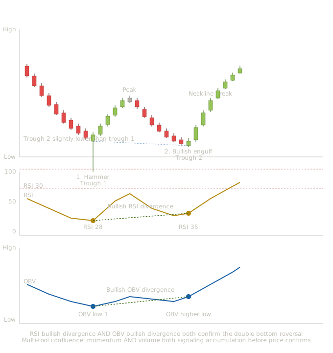
Double bottom (Lesson 17) with hammer at the first trough and bullish engulfing at the second trough — RSI bullish divergence and OBV bullish divergence both confirming accumulation across the two troughs
This chart shows what happens when both momentum and volume divergences appear at the same structural moments in a chart pattern reversal. The double bottom from Lesson 17 provides the structural framework. The hammer at the first trough (Lesson 3) and bullish engulfing at the second trough (Lesson 5) provide candle-level reversal signals. RSI shows bullish divergence between the two troughs (price slightly lower, RSI higher) confirming momentum exhaustion. OBV shows bullish divergence between the same two troughs (price slightly lower, OBV higher) confirming accumulation.
The first trough — single-tool reading. At the hammer with the first trough completing, a trader watching only price action sees a candle reversal at an extended downtrend low. A trader watching only RSI sees RSI at 28 (oversold). A trader watching only OBV sees OBV near its lows. Each tool individually gives a signal that could be acted on at this point, but none provides confluence with the others yet.
The recovery between troughs. Five bullish candles drive price up to the developing neckline. RSI rises from 28 toward 50. OBV rises slightly. The market is in a recovery that could be the start of a reversal or just a temporary rally within a continuing downtrend.
The decline to the second trough. Price declines back toward the prior trough's level. Notice what happens with the two tools during this decline: RSI doesn't fall as far as it did during the original decline (the bullish RSI divergence develops). OBV doesn't fall as far as it did either (the bullish OBV divergence develops). Both tools are signaling that the underlying conditions are stronger than price suggests.
Multiple signals align simultaneously: candle reversal pattern (bullish engulfing), chart pattern structural moment (double bottom second trough), RSI bullish divergence (RSI at 35 versus 28 at first trough), and OBV bullish divergence (OBV higher than at first trough despite slightly lower price).
The conviction level at this moment is dramatically higher than the conviction at the hammer. The hammer alone had one analytical layer supporting it. The bullish engulfing at the second trough has four layers supporting it: candle, chart pattern, momentum, and volume.
The breakout and trend continuation. Price breaks decisively above the neckline. RSI continues higher. OBV expands. All four analytical dimensions confirm the trend reversal.
What this combined chart teaches. The RSI plus OBV combination demonstrates the principle of using tools from different analytical categories together. RSI measures momentum (the speed of price change). OBV measures volume (the conviction behind price changes). These are independent dimensions — RSI can be high or low regardless of OBV, and vice versa. When they agree at the same structural moments, the agreement is genuine confluence rather than the same information presented twice.
Compare this to stacking multiple momentum oscillators (RSI plus Stochastic plus Williams %R). Those tools all measure similar things and tend to agree by default. Their agreement is statistical noise rather than meaningful confluence. RSI plus OBV is a fundamentally different kind of agreement because the tools measure genuinely different aspects of the price action.
The integration framework's value comes from this kind of cross-category confluence, not from within-category stacking.
Combination chart 2: ADX plus Fibonacci retracement with bull flag. This chart shows trend strength filtering combined with structural levels. The bull flag from Lesson 20 provides the chart pattern structure. The candle pattern at the flag's bottom provides timing precision. ADX confirms that the underlying trend is strong enough to expect flag continuation. The Fibonacci retracement levels drawn from the prior swing provide objective reference points for where the flag should find support.
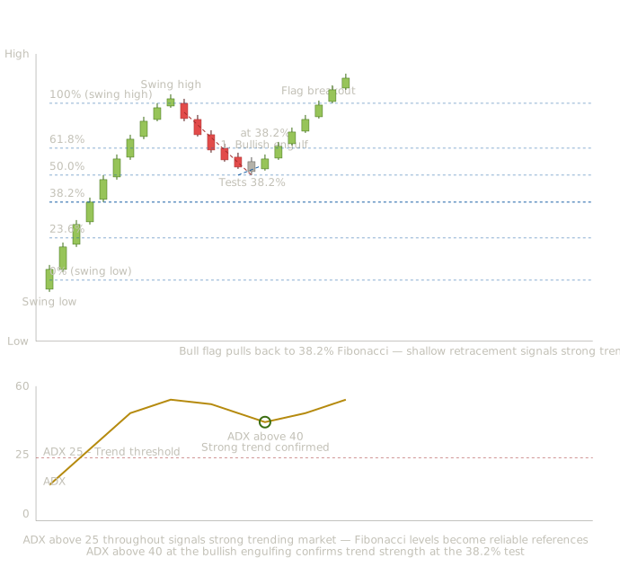
Bull flag (Lesson 20) with bullish engulfing at the 38.2% Fibonacci retracement level, and ADX above 40 throughout confirming exceptional trend strength — regime filter and structural level working together
This chart shows what happens when trend strength confirmation and structural levels work together. The bull flag from Lesson 20 provides the chart pattern. The bullish engulfing candle (Lesson 5) at the flag's bottom provides timing precision. ADX confirms that the underlying trend is strong throughout. The Fibonacci 38.2% retracement provides the specific structural level where the flag should find support.
The strong uptrend establishment (candles 1-10). Ten bullish candles drive price from the swing low to the swing high. ADX rises steadily throughout, eventually reaching above 40. This high ADX reading confirms the trend is genuinely strong — not just a brief move but a sustained directional advance with real momentum.
ADX as regime filter. The ADX above 25 throughout the uptrend tells the trader that trend-following strategies are appropriate. If ADX had been below 25 (ranging market), the bull flag pattern would have lower expected reliability because flags are continuation patterns that require an underlying trend to continue.
The flag pullback (candles 11-15). Five bearish candles drive price down from the swing high. The pullback's depth becomes important. Where will it find support?
Drawing Fibonacci retracement. The retracement is drawn from the swing low to the swing high. The levels at 23.6%, 38.2%, 50%, 61.8%, and 78.6% become potential support levels for the pullback.
Price tests the 38.2% Fibonacci level. The decline finds support at exactly the 38.2% retracement. The 38.2% is considered a shallow retracement, typical of strong trends where buyers step in quickly. The fact that the pullback stopped at 38.2% rather than continuing deeper to 50% or 61.8% itself is bullish — it suggests buyers are eager to add to positions on minor weakness.
Small body at the 38.2% level. A small-body candle forms at the Fibonacci support, showing seller exhaustion at the structural level.
A bullish engulfing pattern completes at the Fibonacci support. The candle reversal pattern at the structural level creates timing confluence with the structural level.
ADX confirmation at the bullish engulfing. Look at the ADX reading at this candle — it's above 40. The trend strength is exceptionally high. The Fibonacci level holding combined with ADX confirming exceptional trend strength means the flag continuation has substantial conviction.
If ADX had been falling toward 25 at this moment, the same bullish engulfing at the same 38.2% level would carry less conviction because the trend strength would be weakening. The two tools together — ADX confirming trend strength, Fibonacci confirming structural support — provide much higher conviction than either alone.
The breakout and trend continuation (candles 18-23). Six bullish candles drive price above the swing high and continue the trend. The flag has completed, the trend has resumed, and the multi-tool analysis was rewarded.
What this combined chart teaches. The ADX plus Fibonacci combination demonstrates how regime filtering enhances structural level analysis. ADX answers 'should I trust trend-continuation signals right now?' Fibonacci answers 'where might the pullback within the trend find support?' Together they tell you both the regime context and the specific entry levels within that regime.
Without ADX, a trader might enter at the Fibonacci 38.2% level during a market that's actually ranging rather than trending. The Fibonacci level would have lower reliability in a ranging market because the broader trend isn't there to support the bullish bias. The ADX filter prevents this kind of misapplication.
Without Fibonacci, a trader using only ADX would know the trend is strong but wouldn't have specific entry references during pullbacks. They'd be left guessing where to enter, possibly entering at random points within pullbacks that produced worse cost basis or missed entries entirely.
The two tools together provide both regime confirmation and entry precision — the combination is more useful than either alone.
Combination chart 3: MACD plus Fibonacci extensions with head and shoulders bottom. This chart shows momentum confirmation combined with profit targets. The head and shoulders bottom (inverse head and shoulders) from Lesson 16 provides the chart pattern reversal. The candle pattern at the head provides timing precision. MACD confirms the momentum shift through bullish crossover and rising histogram. The Fibonacci extensions provide objective profit targets calculated from the pattern's structural points.
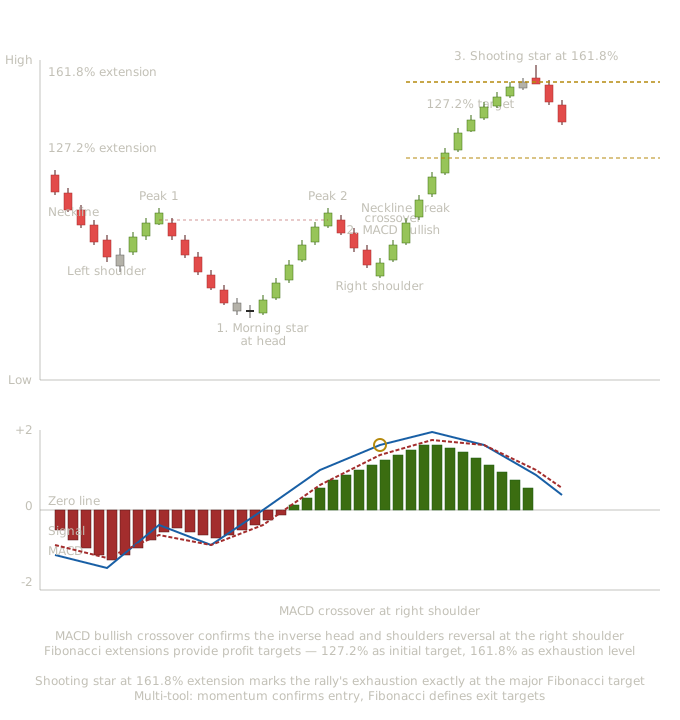
Inverse head and shoulders (Lesson 16) with morning star at the head and MACD bullish crossover at the right shoulder, with Fibonacci extension targets at 127.2% and 161.8% — momentum confirmation and target projection working together
This chart shows what happens when momentum confirmation and target projection work together. The inverse head and shoulders (head and shoulders bottom) from Lesson 16 provides the chart pattern reversal structure. The morning star at the head (Lesson 7) provides timing precision. MACD provides momentum confirmation through the bullish crossover at the right shoulder. Fibonacci extensions provide objective profit targets at 127.2% and 161.8%.
The downtrend and left shoulder formation (candles 1-5). Five bearish candles drive price down, with the lowest point becoming the left shoulder of the inverse head and shoulders pattern. MACD reads strongly negative with the histogram deeply red — bearish momentum confirmed.
The recovery and peak 1 (candles 6-9). Four bullish candles recover from the left shoulder, reaching the first peak that will become part of the eventual neckline. MACD histogram bars start shrinking — bearish momentum is fading.
The decline to the head (candles 10-15). Six bearish candles drive price down to the head — the lowest point of the entire pattern, slightly below the left shoulder's low. Notice the MACD histogram during this decline. The bars are still negative but smaller than during the original decline. The momentum is fading even as price makes a new low — early bullish divergence development.
A three-candle morning star pattern completes at the head's structural low. From Lesson 7, this is a powerful bullish reversal pattern. From Lesson 16, this marks the lowest point of the inverse head and shoulders. The MACD histogram is now nearly zero — bearish momentum has exhausted.
The recovery to peak 2 (candles 19-23). Five bullish candles drive price up to the second peak (completing the right side of the neckline). The MACD histogram has now flipped to positive (green bars) — bullish momentum is emerging. The MACD line is approaching its signal line from below.
The pullback to the right shoulder (candles 24-26). Three bearish candles pull price back to form the right shoulder. The right shoulder is higher than the head (a structural requirement of the inverse head and shoulders pattern). MACD remains positive through this pullback, with only modest histogram contraction — the bullish momentum is holding through the right shoulder formation.
The MACD line crosses above the signal line. This crossover occurring at the right shoulder's structural low creates exact timing confluence — momentum signal (MACD crossover) aligned with chart pattern position (right shoulder completion).
The trader watching only price might be uncertain whether the right shoulder represents continuation of the recovery or the start of another decline back to the head. The MACD bullish crossover at this exact moment provides momentum confirmation that the recovery is genuine.
The breakout above the neckline (candle 28). Price drives decisively above the neckline. The inverse head and shoulders has completed structurally. MACD continues bullish with expanding positive histogram.
Drawing Fibonacci extensions. The extensions are projected from the inverse pattern's structural points. The 127.2% extension above the neckline marks the initial profit target. The 161.8% extension marks the major target where strong moves often exhaust.
The trend continuation and target progression (candles 29-37). Nine bullish candles drive price progressively higher. Price reaches and slightly exceeds the 127.2% extension. The MACD histogram continues positive but starts contracting — bullish momentum is still in force but slowing.
A shooting star forms at exactly the 161.8% Fibonacci extension level. From Lesson 3, the shooting star is the canonical bearish reversal candle. At the 161.8% extension, this candle pattern carries amplified significance — extreme momentum has reached the major Fibonacci target.
Look at the MACD at this moment. The histogram has been shrinking for several bars. The MACD line is approaching the signal line from above (preparing for a bearish crossover). The momentum was already showing signs of fading before the candle confirmed it. The combination of candle pattern, Fibonacci target, and developing momentum weakness creates a high-conviction exit signal.
The reversal toward the neckline (candles 39-40). Two bearish candles drive price down from the 161.8% extension. The shooting star at the major Fibonacci target was validated by sustained directional reversal.
What this combined chart teaches. The MACD plus Fibonacci extensions combination demonstrates how momentum confirmation and target projection work together. MACD answers 'is the momentum supporting this trade?' Fibonacci extensions answer 'where should I take profits if the momentum continues?' Together they provide both entry conviction and exit planning.
Without MACD, a trader entering at the right shoulder of the inverse head and shoulders would have structural reason to expect a reversal but no momentum confirmation. The MACD bullish crossover at the right shoulder provides the timing confirmation that the structural setup is being validated by the underlying momentum.
Without Fibonacci extensions, a trader who entered at the right shoulder would have no objective profit targets. They might exit at the 127.2% level out of fear, or hold past the 161.8% level out of greed. The Fibonacci extensions provide objective reference points that take some of the emotional decision-making out of profit management.
The two tools together provide a complete trade lifecycle structure — entry confirmation through MACD, exit targeting through Fibonacci. This is what working analysis actually looks like: multiple tools answering different questions about different phases of the trade.
Each chart includes the candle pattern reinforcement from Lessons 1-13 and a chart pattern from Lessons 14-28, so readers see how the two new tools combine not just with each other but with the full analytical framework the curriculum has built. The progressive integration principle holds — readers are reminded of everything they've learned while seeing new combinations.
How This Lesson Connects to What Comes Next
Lesson 42 covers building a personalized trading methodology that integrates everything from Lesson 1 through Lesson 41 into an approach the reader can systematically apply to their own trading. The lesson covers how to select which tools belong in your personal toolkit, how to develop systematic checklists for different market contexts, how to evaluate methodology performance, and how to refine the methodology over time.
Key Takeaways
- The seven dimensions of integrated analysis: trend context, chart pattern structure, candle pattern timing, momentum, volume, volatility, and structural levels — each provides independent information
- Genuine confluence requires independent information from different categories; stacking multiple tools from the same category creates the illusion of confirmation without genuinely independent signals
- The minimum effective toolkit covers all seven dimensions: one trend tool + one momentum tool + one volatility tool + one volume tool + one trend strength filter + chart patterns + candle patterns + structural levels
- The confluence checklist: trend check → structure check → candle check → momentum check → volume check → volatility check → level check — a trade with positive alignment across most dimensions has high conviction
- Hierarchy when dimensions conflict: structural levels and chart patterns outweigh oscillators; trend context outweighs any single signal; candle patterns at structural moments outweigh the same patterns in random locations
- Disagreements between dimensions provide information rather than just confusion — bullish trend with bearish momentum divergence warns of approaching exhaustion; bullish pattern with bearish volume warns the pattern may fail
Quiz — 3 Questions
Answer one at a timeA trader identifies a potential short trade. They check their analysis: RSI shows bearish divergence at the price high. MACD has crossed below its signal line. Stochastic is in overbought territory. Williams %R is at -15 (near overbought). The chart shows no clear chart pattern and the trend is unclear. How should the trader assess this setup's confluence?
In this lesson
400 — Technical Indicators — Integration and Methodology