Moving Average Crossovers
Crossovers are confirmation signals, not prediction signals. They represent structural shifts that have already begun in the underlying price action — understanding this distinction is what separates traders who use crossovers thoughtfully from traders who follow them mechanically.
- Define crossover, golden cross, death cross, price-moving-average crossover, crossover lag, whipsaw, and confluence with crossover
- Explain the structural meaning of a two-moving-average crossover and why it necessarily lags price action
- Distinguish between price-moving-average crossovers and two-moving-average crossovers
- Explain the golden cross and death cross with appropriate context about their actual predictive power
- Identify the whipsaw problem and explain why ranging markets cause it
- Apply crossovers as confirmation signals within the integrated price action framework
What Crossovers Actually Are
A crossover happens when one moving average crosses through another, or when price crosses through a moving average. The crossover represents a specific moment in time: the moment when the relationship between two different smoothing levels of the same price data changes direction. Crossovers have been used as trading signals for as long as moving averages have existed, and they're prominent enough in trading culture that even non-traders have heard of the 'golden cross' and 'death cross.'
This lesson covers what crossovers actually mean structurally, why their reliability is more limited than their popularity suggests, how to use them effectively despite that limited reliability, and how the thinkorswim platform automates crossover detection through its Crossover Studies category. The lesson builds directly on Lessons 30 and 31 — readers need to understand what individual moving averages represent before they can understand what it means when those moving averages cross each other.
The fundamental insight to internalize early in this lesson is that crossovers are not new information. When a fast moving average crosses above a slow moving average, that crossover is mathematically equivalent to saying recent prices have risen faster than older prices — which is information that's already visible in the underlying price action. The crossover is a summary signal that crystallizes a directional change that has already begun. This is why crossovers used as standalone trade signals produce mediocre results: by the time the crossover happens, the move it represents is already underway.
What crossovers actually offer is structured confirmation. Used as one input among many — alongside the candle patterns, chart patterns, and broader indicator analysis the curriculum has built — crossovers add a specific, easily-identifiable confirmation signal that supplements other analysis. They're not predictive on their own, but they're useful within integrated analysis.
Vocabulary
| Term | Definition |
|---|---|
| Crossover | Any moment when one line crosses through another on a chart. In moving average context, this means either two moving averages crossing each other, or price crossing through a moving average. The crossover marks a specific bar where the relationship between the two lines changes direction. |
| Bullish crossover | When a shorter-period moving average crosses above a longer-period moving average, or when price crosses above a moving average. The 'bullish' label reflects the typical interpretation that the crossover signals upward directional change. |
| Bearish crossover | The inverse. When a shorter-period moving average crosses below a longer-period moving average, or when price crosses below a moving average. Typically interpreted as signaling downward directional change. |
| Golden cross | The most famous bullish crossover. Specifically refers to the 50-period simple moving average crossing above the 200-period simple moving average on a daily chart. Has become a structurally significant signal partly because so many traders and financial media watch for it. When a golden cross occurs on a major index, it often makes news headlines. |
| Death cross | The inverse of the golden cross. The 50-period SMA crossing below the 200-period SMA on a daily chart. Often interpreted as signaling the beginning of a bear market or major decline. Like the golden cross, gets significant media attention when it occurs on major indices. |
| Price-moving-average crossover | When price itself crosses above or below a moving average, as opposed to two moving averages crossing each other. The two types of crossovers carry different information: two-moving-average crossovers reflect changes in the relationship between two smoothing levels; price-moving-average crossovers reflect the relationship between current price and its recent average. |
| Crossover lag | The delay between when the underlying price action begins changing direction and when the resulting crossover occurs. This lag is fundamental to crossovers — they're derived from moving averages, which themselves lag, so crossovers necessarily lag even more. The lag is greater for longer-period crossovers (golden cross has more lag than a 5/15 crossover) and less for shorter-period crossovers. |
| Whipsaw | When a crossover occurs and then reverses quickly, producing a false signal followed by another crossover in the opposite direction. Whipsaws are especially common in ranging markets where moving averages cross repeatedly without sustained directional movement. They're the main reason crossover-only strategies perform poorly. |
| Confirmation candle | A candle that closes decisively past the crossover level after the crossover has occurred. Used to confirm the crossover is real rather than a temporary boundary touch that will reverse. Many traders wait for a confirmation candle before treating a crossover as actionable. |
| Crossover scanning | Using the platform's scanning tools to identify securities currently experiencing specific crossovers across a watchlist or the broader market. Allows traders to focus their attention on securities where moving averages are signaling potential trade opportunities. |
| Crossover studies | The thinkorswim category that includes automated crossover detection for various indicator pairs. The platform's Crossover Studies category includes ADX Crossover, Bollinger Bands Crossover, MACD Histogram Crossover, Momentum Crossover, Money Flow Index Crossover, Moving Average Crossover, Parabolic SAR Crossover, Price Average Crossover, RSI Crossover, Rate of Change Crossover, and Stochastic Crossover. Each automates the detection of a specific crossover type within its underlying indicator. |
| Confluence with crossover | When a crossover occurs at the same moment as other analytical signals — a candle reversal pattern, a chart pattern completion, a structural support or resistance test. Crossovers in confluence with other signals are substantially more reliable than crossovers occurring in isolation. |
The Structural Meaning of Two-Moving-Average Crossovers
When two moving averages of different periods cross each other, the crossover represents something specific structurally. Understanding what it represents is what separates traders who use crossovers thoughtfully from traders who follow them mechanically.
A shorter-period moving average reflects recent price action; a longer-period moving average reflects price action over a broader time horizon. When the shorter moving average is above the longer moving average, recent prices have on average been higher than the broader average. When the shorter is below the longer, recent prices have on average been lower than the broader average.
The crossover moment — when the shorter moving average crosses the longer — represents the specific point where the relationship between recent and broader price action has flipped. Before the crossover, the broader average was leading the recent average in one direction; after the crossover, the recent average has overtaken the broader. This crossover represents a structural shift in the relationship between time horizons.
What this means practically: a bullish crossover represents the moment where recent price action has been bullish enough to bring the recent average above the broader average. This is a real structural fact about the price action. But it's a derived fact — it doesn't tell you what price is doing right now, only what's already happened that produced the crossover. By the time the crossover prints, the bullish move that produced it is already several bars in.
This is why crossovers lag. The shorter moving average needs enough bars of upward movement to pull above the longer moving average, and that pulling-above happens after the upward movement has begun. The greater the period difference between the two moving averages, the more upward movement needs to occur before the crossover happens, and therefore the more the crossover lags.
Price-Moving-Average Crossovers vs. Two-Moving-Average Crossovers
When price itself crosses above or below a moving average, the crossover represents something different than when two moving averages cross each other.
Price represents the current consensus value. The moving average represents the recent average value. When price crosses above its moving average, current price has just become higher than the recent average — meaning the very latest bar has moved strongly enough to push price above where the recent average sits. When price crosses below its moving average, the latest bar has moved low enough to push price below the recent average.
Price-moving-average crossovers respond faster than two-moving-average crossovers because they don't require waiting for the shorter moving average to catch up to the longer one. The crossover happens as soon as price itself moves through the moving average's level. The trade-off is that price-moving-average crossovers are more sensitive to noise — a single volatile bar can produce a crossover that quickly reverses.
This is the fundamental trade-off across crossover types: faster crossovers respond sooner but produce more false signals; slower crossovers respond later but with more confirmation. Different traders position themselves at different points on this spectrum based on their trading style and risk tolerance.
The Golden Cross and Death Cross
The 50-period SMA crossing above or below the 200-period SMA on a daily chart deserves specific attention because of its cultural prominence. These signals receive media attention disproportionate to their actual predictive power, but the media attention itself creates real market effects worth understanding.
Why the golden cross gets attention. The 50-day and 200-day moving averages have been canonical reference points for decades. Financial publications, market commentary, and broker research routinely reference them. When the 50-day crosses above the 200-day on a major index like the S&P 500 or a major stock, it makes news. Trading communities discuss it. Algorithmic systems trigger on it. The signal becomes structurally significant partly because so many participants are watching for it.
This creates a self-fulfilling element. When a golden cross occurs, traders who were waiting for it enter long positions. The increased buying pressure can push prices higher, validating the signal that triggered the buying. The signal works partly because traders make it work.
The honest reality of golden cross reliability. The signal's actual predictive power is modest. Research generally finds that golden crosses do precede positive returns on average, but the edge is small and the variance is large. Some golden crosses precede major bull markets; others precede continued sideways movement or even declines. The signal alone doesn't justify high-conviction trading.
Why the death cross gets attention. The mirror image — the 50-day crossing below the 200-day — gets even more attention because it's interpreted as signaling impending decline. The cultural narrative around death crosses treats them as ominous warnings, and they often generate fearful media coverage when they occur on major indices.
The honest reality of death cross reliability. Similar to golden crosses, death crosses have a small edge but high variance. Some death crosses precede major bear markets (the 2007-2008 financial crisis death cross is a famous example); many others precede ranging markets or even continued declines that prove temporary. The signal alone doesn't justify high-conviction shorting or panic selling.
How to use golden and death crosses thoughtfully. Treat them as one input among many. When a golden cross occurs alongside other bullish signals — broader bullish chart pattern context, supportive candle action, expanding volume — the multi-layer signal has real value. When a golden cross occurs in isolation without supporting confluence, the signal is much weaker. The same applies to death crosses.
The golden cross and death cross are confirmation signals more than prediction signals. They confirm that a directional shift is already underway. The question for the trader isn't 'should I buy because there's a golden cross?' but rather 'given that there's a golden cross, what does the broader analytical context suggest about whether the directional shift will continue?'
The Whipsaw Problem
The biggest practical problem with crossover-based trading is whipsaws — false crossovers that occur and then quickly reverse, producing repeated losses for traders who follow the signals mechanically.
How whipsaws happen. Whipsaws occur most often in ranging markets where price oscillates without sustained direction. Moving averages of different periods cross and uncross repeatedly as price moves up and down within the range. Each crossover triggers a signal that gets reversed before the position becomes profitable, producing a series of small losses that accumulate.
Why ranging markets cause whipsaws. Moving averages assume some underlying directional movement that they're trying to smooth. When the directional movement is absent — when price is genuinely oscillating without trend — the moving averages cross multiple times as price moves around them. Each crossover represents a real change in the moving average relationship, but the changes don't reflect meaningful trend shifts. They reflect the natural oscillation of price within a range.
Consider a stock trading in a range between $100 and $110. The 9-period EMA might cross above the 20-period EMA when price rallies from $102 to $108, triggering a bullish signal. A trader buys at $108. Price then declines from $108 to $103, and the 9-period EMA crosses back below the 20-period EMA, triggering a bearish signal. The trader sells at $103, taking a loss. Price rallies again from $103 to $107, triggering another bullish signal. The trader buys at $107. Price declines to $102, triggering another bearish signal. The trader sells at $102, taking another loss. Across this oscillation, the trader has bought and sold multiple times based on crossover signals, accumulating losses each time. The crossovers were 'correct' in the narrow sense — each one represented a real change in moving average relationship — but they produced losing trades because the underlying assumption (sustained directional movement) wasn't valid.
The most reliable approach is using a trend filter that prevents trading when markets aren't trending. The ADX indicator (which we'll cover in a later lesson) specifically measures trend strength and can serve this purpose — only take crossover signals when ADX confirms a strong trend is in place. Other approaches include using longer-period moving averages that produce fewer crossovers, requiring confirmation candles before acting on crossovers, or simply accepting that crossover-only strategies will have periods of poor performance in ranging markets.
The thinkorswim Crossover Studies
The platform automates crossover detection through its Crossover Studies category. Rather than requiring traders to manually identify crossovers on each chart, the studies mark crossovers automatically with arrows or signals.
- Moving Average Crossover study — Specifically designed for moving average crossovers. The trader specifies the two moving averages (their types and periods), and the study marks where they cross. Eliminates the need to manually watch for crossovers across multiple charts.
- Other crossover studies in the category — The platform extends the crossover automation concept to other indicator pairs. ADX Crossover marks where the +DI and -DI lines of the ADX cross each other. Bollinger Bands Crossover marks where price crosses the upper or lower band. MACD Histogram Crossover marks where the MACD histogram crosses zero. Momentum Crossover, Money Flow Index Crossover, RSI Crossover, Rate of Change Crossover, and Stochastic Crossover all work similarly for their respective indicators. Each automates the detection of a specific signal type within its underlying indicator.
- What the crossover studies actually accomplish — They reduce manual effort, not analytical complexity. The crossover study marks the same crossover the trader would identify manually — it doesn't add any new analysis. The value is in scanning efficiency: a trader monitoring fifty stocks can use crossover studies to quickly identify which stocks have current crossovers worth analyzing, rather than visually scanning each chart.
- What crossover studies don't accomplish — They don't make crossovers more reliable. A crossover marked automatically by the study has the same reliability as a crossover the trader spots manually. The automation is a productivity tool, not an analytical improvement.
Use them as scanning aids. Set up a watchlist or scan with crossover-based filters to identify candidates for deeper analysis. Then apply the integrated reading framework — candle patterns, chart patterns, broader indicator context — to determine which crossover candidates actually represent high-conviction setups. Don't trade crossovers mechanically based on the study's signals.
Pattern Statistics and Sources
The published research on moving average crossovers is generally consistent: crossovers used as standalone trade signals produce mediocre results, but crossovers used within integrated analysis perform better.
- Liberated Stock Trader's extensive research across moving average strategies including crossover-based approaches consistently finds that mechanical crossover trading underperforms buy-and-hold strategies across most timeframes and most stocks tested. The simple moving average lost to buy-and-hold 88% of the time when used as a standalone signal across 960 years of data covering 30 Dow Jones stocks.
- On the golden cross and death cross specifically: independent research has examined the predictive power of these signals on major indices going back decades. The general finding is that golden crosses do precede positive average returns and death crosses do precede negative average returns, but the edges are small enough that mechanical trading based purely on these signals doesn't significantly outperform simpler approaches. The signals become more useful when combined with other analysis rather than treated as autonomous triggers.
- On crossover whipsaws: research consistently identifies whipsaws as the primary source of losses in crossover-based strategies. Moving average strategies produce 80% of their losses in consolidating markets where whipsaws are most common. This finding holds across different moving average periods and different crossover combinations. The structural problem isn't with any specific crossover but with the underlying logic of treating crossovers as standalone signals.
- liberatedstocktrader.com — Extensive backtested research on crossover strategies including specific reliability figures
- quantifiedstrategies.com — Methodology-focused research on different crossover approaches
- thinkorswim.com — Official platform documentation on the crossover studies and their calculation methodologies
- Academic literature via Google Scholar — Search 'moving average crossover,' 'golden cross death cross,' 'technical analysis trading rules'
Common Student Mistakes with Moving Average Crossovers
- Treating crossovers as autonomous trade signals — The most common mistake. Crossover-only strategies produce mediocre results because crossovers are derived signals — they reflect changes that have already begun in the underlying price action. Using them as standalone triggers means trading on lagging information.
- Trading every crossover regardless of context — Different market conditions produce different crossover reliability. Crossovers in confirmed trending markets work better than crossovers in ranging markets. Crossovers occurring alongside other supporting signals work better than crossovers occurring in isolation. Mechanical trading of every crossover ignores these context distinctions.
- Believing the media narratives about golden and death crosses — The cultural prominence of these specific crossovers creates inflated expectations about their predictive power. The actual edge is small enough that mechanical trading doesn't produce strong outperformance. Readers who expect dramatic results from following these signals will be disappointed.
- Switching between crossover combinations after losses — When a 9/20 EMA crossover strategy produces losses, the temptation is to switch to a 5/15 EMA crossover or a 20/50 SMA crossover or some other combination. This variant-shopping behavior (extending the mindset issue from Lesson 31) wastes time without improving results because the underlying problem isn't the specific periods chosen — it's the mechanical use of crossovers as autonomous signals.
- Ignoring whipsaws when backtesting — A backtest that shows a crossover strategy worked over a specific period might not capture extended ranging periods where whipsaws would have produced significant losses. Readers evaluating crossover strategies should specifically check how they performed during sideways markets, not just during trending markets.
- Using crossover studies as autonomous signals just because they're automated — The platform's automation makes crossovers easier to identify but doesn't make them more reliable. Treating automated crossovers as inherently more meaningful than manually identified crossovers is a category error.
- Confusing different crossover types — Two-moving-average crossovers and price-moving-average crossovers carry different information. Mixing them analytically can produce confused conclusions. Readers should specifically distinguish between these crossover types when discussing or analyzing them.
- Ignoring the timeframe in which the crossover occurs — A crossover on a daily chart and a crossover on a 5-minute chart have fundamentally different significance. The daily crossover represents weeks of price action; the 5-minute crossover represents minutes. Treating them as equivalent leads to mismatched expectations.
Integrated Chart — Golden Cross with Double Bottom and Named Candle Patterns
This chart shows what the integrated reading looks like when a golden cross appears at a major structural turning point. The 50-period SMA (red) and 200-period SMA (blue) are the canonical golden cross moving averages, and they're shown alongside a complete double bottom chart pattern with four named candle patterns at structural moments.
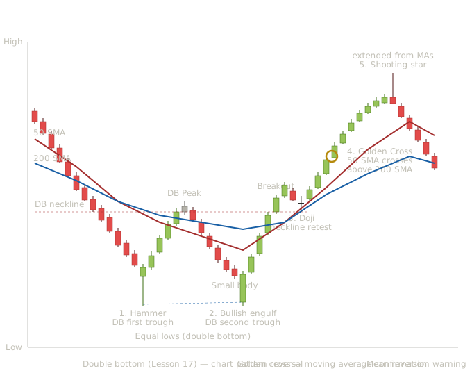
Golden cross (50/200 SMA) appearing after a double bottom with Hammer, Bullish Engulfing, Doji, and Shooting Star — showing the crossover's structural position late in the reversal sequence
The downtrend (candles 1-13). Thirteen bearish candles establish the prevailing downtrend. Both the 50 SMA and the 200 SMA slope downward, with the 50 SMA below the 200 SMA — the canonical configuration during a confirmed downtrend. This is the structural context that gives any subsequent reversal its meaning. Without an extended downtrend, the double bottom and golden cross that follow wouldn't represent anything significant.
The moving averages tell the trader something important even before any reversal signals appear: the longer-term trend is genuinely bearish. The 200 SMA isn't just sloping down recently — it's been sloping down long enough that the 50 SMA is well below it. This represents months of bearish price action, not a brief decline.
A hammer forms at the bottom of the extended decline. From Lesson 3, this is the canonical hammer reversal candle. From Lesson 17, this marks the potential first trough of a double bottom. The moving averages are still sloping downward — no confirmation yet from the moving average side.
Notice the location quality. The hammer appears at extended downtrend location with both moving averages well above it. The candle reversal in itself is meaningful, but the trader watching the moving averages knows the broader trend hasn't yet shifted. This is the moment for a small starter position based on the candle signal alone, not full conviction.
The recovery rally between troughs (candles 15-18). Four bullish candles drive price up to what becomes the double bottom's neckline. The hammer's signal has been validated by sustained follow-through. The moving averages are still sloping downward but starting to flatten as the recovery develops.
The double bottom peak (candle 19). A small-body candle marks the recovery's peak — the level that becomes the double bottom's neckline. The moving averages remain in their bearish configuration (50 SMA below 200 SMA), but the slope of the 50 SMA is starting to ease.
The decline to the second trough (candles 20-25). Six bearish candles drive price back down to retest the prior trough's level. The bodies get progressively smaller as the decline approaches the structural support — fading bearish conviction at known support. This is the body-trajectory reading habit the curriculum has reinforced throughout.
Small body just before the second trough (candle 26). A very small bearish body shows seller exhaustion immediately preceding the structural support level.
A long bullish candle opens below the prior small bearish candle's close and rallies powerfully to engulf its body completely. From Lesson 5, this is the bullish engulfing pattern. From Lesson 17, this is the structural completion of the double bottom's second trough — the same level as the first trough, defended by decisive candle reversal.
This is the multi-layer signal with substantial conviction. The candle pattern, the chart pattern's structural position, and the dynamic support from the moving averages all align at this single moment. A trader using the integrated reading would take a meaningful position here — significantly larger than at the hammer because the structural confirmation is now in place.
The rally to the neckline breakout (candles 28-31). Four progressively larger bullish candles drive price decisively above the neckline. The breakout candle (candle 31) is a powerful near-marubozu. The double bottom has now completed structurally. The 50 SMA has flattened and is starting to slope upward — the moving averages are responding to the new bullish price action.
Price pulls back briefly to retest the broken neckline from above. A doji forms at exactly this retest point. From Lesson 2, the doji shows pure indecision at the structural moment. From Lesson 15, this is the role reversal where broken resistance becomes support. The moving averages are now both flattening with the 50 SMA approaching the 200 SMA from below.
The trend establishment (candles 34-38). Five bullish candles drive price progressively higher. The 50 SMA is climbing toward the 200 SMA at an accelerating pace. The new uptrend is structurally clean — chart pattern completed, candle confirmation in place, broader market context turning bullish.
The 50-period SMA crosses above the 200-period SMA. This is the canonical golden cross signal — the moment where the broader long-term trend has officially shifted from bearish to bullish according to the moving average framework.
The pedagogical significance of where the golden cross appears in this sequence matters. The golden cross is the last signal to appear, not the first. The hammer suggested reversal first. The bullish engulfing confirmed it. The neckline breakout confirmed it again. The doji at neckline retest confirmed it a third time. Only after all of these structural signals have aligned does the golden cross finally print.
This is the honest reality of crossovers from Lesson 32 in visible form. The golden cross lags the actual reversal by many bars — by the time it prints, the reversal has been confirmed multiple times by other analysis. A trader who waited only for the golden cross entered substantially later than the integrated reading allowed. A trader who used the integrated reading entered at the bullish engulfing (signal 2) and was positioned for the entire move.
The continued uptrend (candles 39-44). Six bullish candles continue the rally with the 50 SMA now above the 200 SMA. Both moving averages slope upward. This is the configuration that confirms the new uptrend is structurally clean — moving averages aligned, both sloping in the same direction, the spread between them reflecting the trend's strength.
A shooting star forms when price has traveled far from its moving averages. From Lesson 3, the candle is the reversal signal. From Lesson 30, the extended distance amplifies the signal's significance.
This is the integrated reading's warning that the rally may be exhausting. The moving averages are still bullish, but price has moved far enough from them that mean reversion has become likely. A trader still in position from the bullish engulfing entry would use this signal to take profits or tighten stops aggressively.
The pullback (candles 46-50). Five bearish candles drive price down toward the moving averages, exactly as the shooting star's signal predicted. The 50 SMA hasn't yet crossed back below the 200 SMA (no death cross yet), but the price action is pulling back toward the moving average support.
The golden cross is structurally meaningful but temporally late. The cultural prominence of the golden cross sometimes creates the impression that it's a primary signal — that traders should wait for it before acting. This chart shows the opposite. The golden cross appeared after the hammer, after the bullish engulfing, after the neckline breakout, after the doji confirmation. By the time the golden cross printed, price had already moved substantially from the actual reversal point. The golden cross confirms what other analysis already showed; it doesn't predict what other analysis missed.
The integrated framework provides multiple entry points with different conviction levels. The hammer offered an early, low-conviction entry. The bullish engulfing offered a high-conviction entry at the structural completion of the double bottom. The neckline breakout offered another entry with even more confirmation. The neckline retest doji offered a re-entry opportunity with reduced risk. The golden cross would have offered a late entry with maximum confirmation but worst cost basis. Different traders making different choices about the conviction-versus-cost-basis tradeoff would all have profited from this setup, just with different cost bases reflecting their different choices.
Chart patterns and moving average signals confirm each other at major structural moments. The double bottom is a structural reversal pattern that often occurs at major trend changes. The golden cross is a moving average signal that also occurs at major trend changes. When both appear in the same sequence on the same chart, they're reinforcing each other — each one confirming what the other suggests. This is the kind of confluence that defines the highest-conviction trading setups.
The progressive integration principle in practice. This chart specifically demonstrates how every category the curriculum has covered works together: candle patterns from Lessons 1-13 (hammer, bullish engulfing, doji, shooting star), chart patterns from the 17-28 range (double bottom from Lesson 17), and moving averages with crossovers from the technical analysis section (50 and 200 SMA, golden cross). Readers should be able to identify each element and understand how they reinforce each other. If a reader looks at this chart and can name each element correctly while understanding how it fits with the others, they've internalized the integrated framework the curriculum is teaching.
Making Trading Decisions with Golden Cross Analysis
The real-time decision-making for this chart shows how the golden cross fits within the integrated framework.
At the hammer (signal 1). The trader sees the hammer at extended downtrend location with both moving averages still sloping downward. Small starter position with stop below the hammer's low. Conviction is modest because the moving averages haven't yet confirmed any reversal — the broader trend is still bearish.
At the bullish engulfing at the second trough (signal 2). This is the high-conviction entry. The double bottom's structural completion combined with the bullish engulfing candle creates the multi-layer signal that warrants meaningful position sizing. The trader who took the small starter at signal 1 adds here to bring total exposure to a full position. The trader who waited enters here. Stop just below the second trough's low.
At the neckline breakout. The chart pattern has now completed structurally. Traders not yet in position have one more entry opportunity here with the most chart-pattern confirmation but worst cost basis. The breakout's strength (a powerful near-marubozu candle) suggests high follow-through probability.
At the neckline retest doji (signal 3). Confirmation rather than entry. The doji at the retested neckline confirms the breakout's structural validity. Traders already in position should see this as validation. Traders looking for a final low-risk entry could enter here with stops just below the retested neckline.
At the golden cross (signal 4). This is structurally significant but entirely confirmatory at this point. The trader is already in position from earlier signals. The golden cross confirms that even the slow-moving 200 SMA has been overcome by the rally, meaning the broader long-term trend has officially shifted. The trader doesn't add to their position at the golden cross because they're already fully positioned. They might use the golden cross as a stop-management trigger — moving their stop up to just below the 50 SMA (which is now above the 200 SMA, creating a strong dynamic support level).
For traders who only watched moving averages. This is the trader who waited only for the golden cross before entering. Their entry is substantially later than the integrated trader's entry. The price they pay is higher. Their risk-reward is worse because their stop placement (likely below recent swing lows) is further from their entry. But they have maximum confirmation that the trend has changed — they trade with very high conviction even though their cost basis is unfavorable.
Neither approach is objectively wrong. The integrated trader gets better cost basis at the price of taking more risk at earlier signals. The moving-average-only trader gets worse cost basis at the benefit of maximum confirmation. Different traders rationally make different choices.
At the shooting star at extended distance (signal 5). The candle warning of trend exhaustion. The trader who entered at the bullish engulfing is now sitting on substantial profits. The shooting star at extended distance suggests taking profits or at minimum tightening stops aggressively. Whether to exit fully or partially depends on the trader's methodology — some traders exit completely on this signal, others scale out over multiple bars, others let the position run with tightened stops looking for further gains.
What actually happens. Price declines after the shooting star, as the signal predicted. The trader who exited captures the profits. The trader who held watches profits erode somewhat before potentially bouncing or continuing down further.
Sometimes the shooting star produces the optimal exit. Sometimes price pulls back briefly and then continues higher, making the exit suboptimal. Either way, taking the signal was the right decision given the available information. Evaluating the decision based on what happened next is what destroys traders. The shooting star at extended distance is a high-quality exit signal because of the integrated reading — not every individual instance produces the best possible outcome, but the signal class as a whole produces better outcomes than ignoring it.
The Mindset for Crossover Signals
The mindset work from Lessons 30 and 31 extends to crossover trading with one specific addition: accepting that confirmation lags the move it confirms.
Traders frustrated with crossovers often complain that the signals come too late — by the time the crossover prints, much of the move has already happened. This complaint reflects a misunderstanding of what crossovers are. Crossovers are not predictions; they're confirmations. They cannot come before the move they confirm because they're derived from that move. The same mathematical lag that makes crossovers possible also makes them late by definition.
Accepting this honestly is what allows crossovers to be useful within trading. A trader who expects crossovers to predict gets disappointed. A trader who uses crossovers as confirmation signals within broader analysis gets value from them. The framing matters because it determines whether the signal serves the trader or frustrates them.
The same applies to whipsaws. A trader who expects crossover signals to be reliable triggers gets frustrated when whipsaws produce repeated losses. A trader who understands that crossovers in ranging markets produce false signals knows to avoid trading them in those conditions. The signal isn't broken in ranging markets — it's being misapplied. Understanding the appropriate context for the signal is part of using it well.
Lesson 33 covers moving average envelopes and Bollinger Bands — the volatility-based extensions of moving averages that add channels above and below the moving average to create dynamic resistance and support levels. The Bollinger Band system in particular is one of the most widely used technical analysis tools in the world, and it builds directly on the moving average foundation Lessons 30, 31, and 32 have built.
The lessons after that move into the dedicated momentum oscillators — RSI in Lesson 34, MACD in Lesson 35, the other momentum tools in Lesson 36. These tools represent a different category of indicator than moving averages and their direct extensions. Moving averages measure where price has been on average; oscillators measure the speed of price change. The two categories provide complementary information, and many integrated strategies use both.
By the time readers complete the moving average and crossover lessons, they have a solid foundation in the trend-identification tools. The volatility tools that come next add the dimension of measuring how much price is moving. The momentum tools after that add the dimension of measuring how fast price is moving. Together, these three categories — trend, volatility, and momentum — form the structural foundation of most technical analysis approaches.
Key Takeaways
- Crossovers are confirmation signals, not prediction signals — by the time a crossover prints, the directional shift it represents is already underway in the underlying price action
- Two-moving-average crossovers (e.g., golden cross) lag more than price-moving-average crossovers — but produce fewer false signals because they require sustained directional movement to occur
- Golden cross = 50-day SMA crosses above 200-day SMA. Death cross = 50-day SMA crosses below 200-day SMA. Both have real but modest edges; media attention creates some self-fulfilling significance
- Whipsaws are the primary source of crossover strategy losses — they occur in ranging markets where moving averages cross repeatedly without sustained direction; ADX is the standard trend-strength filter used to avoid them
- The candle leads; the crossover confirms. Hammer at the trough appears first; the subsequent bullish MA crossover confirms bars later. Using both gives earlier entry AND more confirmation than either alone
- The thinkorswim Crossover Studies category automates crossover detection for scanning efficiency — this is a productivity tool, not an analytical improvement; the signals are no more reliable than manually spotted crossovers
Quiz — 3 Questions
Answer one at a timeA golden cross (50-day SMA crossing above 200-day SMA) appears on a daily chart. A trader using only this signal enters long. What is the primary structural limitation of this approach?
In this lesson
400 — Technical Indicators — Integration and Methodology