MACD — Moving Average Convergence Divergence
MACD combines trend direction, momentum strength, and reversal signals into a single three-component tool. Where RSI compares recent gains to losses, MACD compares two moving averages to extract momentum from their relationship — making it the most versatile single momentum tool in common use.
- Explain the conceptual difference between MACD and RSI as momentum tools
- Identify the three MACD components and explain what each one measures
- Calculate the MACD line, signal line, and histogram given EMA values
- Read MACD's zero line position, signal line crossovers, and histogram patterns as distinct signals
- Identify MACD bullish divergence and explain why it precedes reversals
- Integrate MACD readings with cup and handle chart patterns and named candle patterns
What MACD Measures and Why It Matters
The Moving Average Convergence Divergence, almost always called MACD (pronounced 'Mac-D'), is the other major momentum oscillator alongside RSI. Developed by Gerald Appel in the late 1970s, MACD has become standard equipment in technical analysis because it combines several useful pieces of information into a single tool: trend direction, momentum strength, and potential reversal signals. Where RSI compares recent gains to recent losses, MACD compares two moving averages of different periods to extract momentum information from their relationship.
The conceptual insight that makes MACD useful: when a short-period moving average is pulling away from a long-period moving average, momentum is accelerating in the direction of the divergence. When the short-period moving average is converging back toward the long-period moving average, momentum is decelerating. MACD captures this convergence and divergence behavior in a single line that traders can read for trend strength and potential reversals.
This lesson covers what MACD is, how it's calculated, how its three components work together, the specific signals MACD provides, common mistakes that destroy traders who use it mechanically, and how to integrate it with the broader analytical framework.
Vocabulary
| Term | Definition |
|---|---|
| MACD (Moving Average Convergence Divergence) | A momentum oscillator that displays the relationship between two exponential moving averages of price. Developed by Gerald Appel in the late 1970s. MACD has three components: the MACD line, the signal line, and the histogram. |
| MACD line | The primary line in the MACD indicator. Calculated as the difference between the 12-period EMA and the 26-period EMA (the default settings). When the 12-period EMA is above the 26-period EMA, the MACD line is positive. When the 12-period EMA is below the 26-period EMA, the MACD line is negative. |
| Signal line | A 9-period EMA of the MACD line. Serves as a smoothed reference for the MACD line. Crossovers between the MACD line and signal line are commonly used as trade signals. |
| MACD histogram | A bar chart displayed alongside the MACD and signal lines. Each bar represents the difference between the MACD line and the signal line at that bar. Positive histogram bars (above zero) mean the MACD line is above the signal line; negative bars (below zero) mean the MACD line is below the signal line. |
| Zero line crossover | When the MACD line crosses above or below zero. A zero line cross occurs when the underlying 12-period and 26-period EMAs cross each other (the MACD line equals zero when they're equal). Zero line crossovers are interpreted as significant trend change signals. |
| Signal line crossover | When the MACD line crosses above or below its signal line (the 9-period EMA of the MACD line). Signal line crossovers occur more frequently than zero line crossovers and are often used as earlier (though less reliable) trade signals. |
| Bullish MACD crossover | When the MACD line crosses above the signal line, typically interpreted as a bullish momentum signal. The crossover can occur above or below zero, with different implications for each. |
| Bearish MACD crossover | When the MACD line crosses below the signal line, typically interpreted as a bearish momentum signal. |
| MACD bullish divergence | When price makes a lower low but MACD makes a higher low. Like RSI divergence, signals that the bearish momentum is fading even as price continues lower. Often precedes meaningful reversals. |
| MACD bearish divergence | When price makes a higher high but MACD makes a lower high. Signals that bullish momentum is fading even as price continues higher. |
| Histogram divergence | A specific form of MACD divergence that uses the histogram rather than the MACD line. Some analysts find histogram divergence to be more sensitive and earlier than MACD line divergence because the histogram captures the rate of change of the MACD-signal relationship. |
| Default settings | The standard MACD parameters of 12, 26, and 9 (12-period EMA, 26-period EMA, 9-period signal line EMA). These defaults come from Appel's original specification and remain standard across all platforms. Changes to these defaults should be backed by specific backtested justification rather than arbitrary preference. |
What the Configuration Settings Actually Mean
When a reader adds MACD to a chart and opens its settings, several configurable parameters appear.
- Fast length. The period of the shorter EMA. Default is 12. Shorter values produce more sensitive MACD that responds faster to recent price changes; longer values produce smoother MACD.
- Slow length. The period of the longer EMA. Default is 26. Together with the fast length, this determines what timeframes of trend MACD is comparing. The 12-26 default compares roughly two-week and one-month trends on a daily chart.
- Signal length. The period of the EMA applied to the MACD line to create the signal line. Default is 9. Shorter values produce a more sensitive signal line; longer values produce a smoother signal line with fewer crossovers.
- Source. Which price from each bar is used. Default is closing price.
- Histogram display. Most platforms allow the histogram to be displayed with positive bars in one color (often green) and negative bars in another color (often red). This visual distinction makes histogram reading easier.
The Math Behind MACD
The MACD calculation involves several steps. Understanding each step reveals what MACD is actually measuring.
Step 1: Calculate the 12-period EMA. Using the EMA calculation from Lesson 30, calculate the 12-period exponential moving average of closing prices. This is the 'fast' EMA.
Step 2: Calculate the 26-period EMA. Similarly, calculate the 26-period EMA of closing prices. This is the 'slow' EMA.
Step 3: Calculate the MACD line. Subtract the 26-period EMA from the 12-period EMA:
MACD Line
MACD Line = 12-period EMA − 26-period EMA
When the 12-period EMA is above the 26-period EMA, the MACD line is positive. When below, negative. The magnitude reflects how far apart the two EMAs are.
Step 4: Calculate the signal line. Calculate the 9-period EMA of the MACD line:
Signal Line
Signal Line = 9-period EMA of MACD Line
The signal line is a smoothed version of the MACD line.
Step 5: Calculate the histogram. Subtract the signal line from the MACD line:
Histogram
Histogram = MACD Line − Signal Line
When the MACD line is above the signal line, the histogram is positive. When below, negative.
Suppose the 12-period EMA is 102 and the 26-period EMA is 100: MACD Line = 102 − 100 = 2 The MACD line reads +2. The fast EMA is above the slow EMA by 2 points, indicating recent prices have been net positive relative to the broader average. Suppose the prior day's MACD line was 1.5, and the 9-period EMA of recent MACD values gives a signal line of 1.7: Histogram = 2 − 1.7 = 0.3 The histogram reads +0.3. The MACD line is above the signal line, meaning momentum is currently above its smoothed reference.
MACD is essentially comparing two moving averages in three different ways simultaneously. The MACD line itself shows whether the fast EMA is above or below the slow EMA. The signal line shows whether this MACD value is above or below its recent average. The histogram shows the relationship between the MACD line and signal line. This three-layer construction is why MACD provides more information than a simple moving average crossover. The MACD line corresponds to the underlying EMA crossover. The signal line crossover provides an earlier (though less reliable) signal of momentum change. The histogram shows the rate of change of the MACD-signal relationship, which can identify momentum changes even earlier.
Reading MACD's Three Components
Each of MACD's three components provides different information that integrated readers use together.
- MACD line position. The MACD line itself tells you the relationship between the fast and slow EMAs. When positive, the fast EMA is above the slow EMA, indicating bullish trend. When negative, bearish trend. The magnitude indicates trend strength — large positive values mean the fast EMA is well above the slow EMA, signaling strong bullish trend. Small values near zero signal weak or transitioning trends.
- Zero line crosses. When the MACD line crosses through zero, it indicates that the fast and slow EMAs have crossed each other. This is mathematically equivalent to a moving average crossover from Lesson 32 — a significant trend change signal but one that lags the underlying price action.
- Signal line position. The relationship between the MACD line and the signal line provides earlier information than zero line crosses. When MACD is above its signal line, momentum is currently strong relative to its recent average. When below, momentum is currently weak.
- Signal line crossovers. When MACD crosses above its signal line, a bullish signal is generated. When it crosses below, bearish. These signals occur more frequently than zero line crossovers and provide earlier trade triggers, though with more false signals.
- Histogram patterns. The histogram visualizes the MACD-signal relationship as bars. Increasing positive histogram values mean bullish momentum is accelerating. Decreasing positive values mean bullish momentum is decelerating (though still positive). Negative values mean bearish momentum. The histogram often signals momentum changes before the MACD line crosses its signal line — when histogram bars start shrinking even while still positive, momentum may be peaking.
- Divergence patterns. Like RSI, MACD shows divergence between price action and momentum. Bullish divergence (price makes lower low, MACD makes higher low) signals fading bearish momentum. Bearish divergence (price makes higher high, MACD makes lower high) signals fading bullish momentum. MACD divergences are often considered among the most reliable signals the indicator provides.
MACD in Trending Versus Ranging Markets
Like RSI, MACD's signals carry different significance depending on whether the market is trending or ranging.
- In trending markets. MACD works well in trending markets because the underlying EMA differences amplify directional movement. Zero line crossovers tend to mark significant trend changes. Signal line crossovers in the direction of the trend (bullish crossovers during uptrends, bearish during downtrends) often mark continuation entries. Divergences identify trend exhaustion before price reflects it.
- In ranging markets. MACD becomes less useful in ranging markets because the EMAs cross each other frequently without sustained directional movement. Both signal line crossovers and zero line crossovers occur but produce whipsaws — false signals that quickly reverse. Traders who use MACD mechanically in ranging markets accumulate small losses from these whipsaws.
Identifying which regime applies. Several methods help identify whether MACD signals should be treated as reliable. ADX (covered in Lesson 38) measures trend strength directly. The relationship between price and longer-period moving averages signals trend versus range. The chart pattern context (consolidation patterns versus trending patterns) provides structural information. The integrated reader uses these contexts to determine whether MACD signals warrant action or skepticism.
Pattern Statistics and Sources
Liberated Stock Trader's comprehensive backtesting of 606,422 test trades on the MACD indicator found a low reliability of 26% on a day trading 5-minute chart and only 3% on a daily chart for standalone MACD strategies. Backtesting on 30 Dow Jones Industrial Average stocks over 20 years showed MACD underperforming buy-and-hold 76% of the time, with 29 of 30 DJIA stocks failing to beat buy-and-hold using standard MACD settings.
QuantifiedStrategies' analysis of MACD accuracy reports that MACD strategies have approximately an 81.41% historical success rate with a profit factor of 1.51 when used in specific combined approaches, though standalone MACD use shows substantially lower performance. Their backtest of a specific MACD strategy on the S&P 500 from 1960 showed 71.5% accuracy across 112 trades.
A combined MACD and RSI strategy demonstrated a 73% win rate over 235 trades on semiconductor ETFs (SMH) from 2001 to present, with an average gain of 0.88% per trade including commissions and slippage. The improvement from standalone MACD use to combined MACD+RSI use illustrates the principle that momentum indicators work better in confluence than in isolation.
Academic research from arxiv.org on MACD strategy effectiveness found that the win rate of strategies using only the MACD indicator is less than 50%. However, win rates substantially improve when MACD is combined with other momentum indicators like Money Flow Index (MFI) or RSI. The research concludes that while all MACD trading strategies can generate positive returns, performance is poor without using other momentum indicators alongside MACD.
The pattern across MACD research is consistent and matches what we've seen with other indicators. Standalone MACD signals produce mediocre results. Combined approaches that integrate MACD with other tools produce substantially better results. The strongest performance comes from combinations like MACD+RSI+mean reversion filters, which can reach 73% win rates compared to sub-50% for MACD alone.
- Gerald Appel's original publications introducing MACD in the late 1970s
- quantifiedstrategies.com — extensive MACD research and combined strategies
- liberatedstocktrader.com — comprehensive backtesting of MACD across thousands of trades
- Academic literature via arXiv and Google Scholar — formal research on MACD effectiveness
- vestinda.com and macdpro.com — practical backtesting examples and methodology
- thinkorswim platform documentation — official MACD implementation details
Common Student Mistakes with MACD
- Treating signal line crossovers as autonomous trade signals. The most common mistake. Mechanical signal line crossover trading produces mediocre results in most testing because the same crossovers occur frequently in ranging markets and produce whipsaws.
- Ignoring the zero line. The MACD line's position relative to zero provides important trend context. Bullish signal line crossovers above zero are stronger signals than the same crossovers below zero. Bearish crossovers below zero are stronger than the same crossovers above zero. Traders who watch only crossovers without zero-line context miss this distinction.
- Missing divergences. MACD divergences provide some of the most reliable signals the indicator gives. Many traders watch for crossovers and miss divergences that often precede meaningful reversals.
- Adjusting settings to fit recent results. Like RSI, MACD's default 12-26-9 settings exist for good reasons. Curve-fitting by adjusting parameters typically produces worse forward results.
- Using MACD on too-short timeframes. MACD requires meaningful price movement to generate reliable signals. On very short timeframes (1-minute, 5-minute), the underlying EMA calculations don't have enough data variation to produce meaningful momentum information.
- Treating histogram changes as standalone signals. Histogram patterns are useful but require context. Histogram divergence that occurs in confluence with chart pattern context is meaningful; histogram fluctuations in random price action are noise.
- Using MACD without trend context. MACD performs much better in trending markets than in ranging markets. Trading MACD signals without identifying the market regime first produces inconsistent results.
Reading MACD Integrated with Prior Lessons
The integrated chart for this lesson follows the progressive integration principle.
Cup and handle pattern (Lesson 22) with morning star at cup bottom, doji at handle low, bullish MACD crossover during cup recovery, and MACD bullish divergence — progressive integration of candle patterns, chart patterns, and MACD
Reading the MACD chart through all three layers
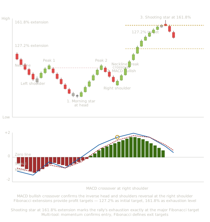
This chart shows what the integrated reading looks like with MACD added below the price chart. The chart includes a cup and handle pattern from Lesson 22, two named candle patterns from Lessons 1-13 (morning star and doji), and the MACD with its signal line, histogram, bullish divergence, and signal line crossover.
The left rim and cup decline (candles 1-9). Price declines from the left rim, forming the left side of the cup. The MACD line is negative and the histogram (red bars) extends below zero, indicating bearish momentum. As the decline progresses and approaches the cup bottom, notice that the histogram bars start shrinking even though they remain negative — this is an early signal that bearish momentum is fading even as price continues lower.
The cup bottom approach (candles 10-12). Price reaches the cup bottom area. The MACD line continues to bottom out, and the histogram has shrunk substantially.
Signal 1 — Morning star at the cup bottom. A morning star three-candle pattern forms at the cup's bottom. From Lesson 7, this is a powerful bullish reversal pattern. From Lesson 22, this is the structural bottom of the cup formation. The MACD at this moment shows the histogram approaching zero and the MACD line preparing to turn upward — momentum is confirming what the candle pattern suggests.
The cup recovery (candles 13-17). Price rallies from the cup bottom toward the right rim. The MACD line crosses above the signal line (signal 3 in the chart). The histogram has flipped from red (negative) to green (positive) and is growing. This is a textbook MACD bullish crossover signal occurring at exactly the right structural moment.
The right rim formation (candles 18-21). Price completes the cup by reaching the right rim, approximately the same level as the left rim. The MACD line peaks and the histogram reaches its maximum positive extension as the cup completes.
The handle development (candles 22-25). Price pulls back from the right rim to form the handle. The MACD line declines as the pullback develops, and the histogram shrinks. This is normal MACD behavior during a healthy handle pullback — momentum cools but doesn't reverse decisively.
Signal 2 — Doji at the handle low. A doji forms at the handle's bottom. From Lesson 2, the doji shows pure indecision at the structural moment. The MACD at this point shows the histogram approaching but not crossing zero, and the MACD line approaching but not crossing the signal line. The momentum is preparing to resume bullishly without ever fully turning bearish.
The handle resolution and breakout (candles 26-31). Price rallies from the handle low, breaks above the right rim resistance, and continues higher. The MACD line crosses back above the signal line, the histogram grows rapidly positive, and both are now well above the prior peak — momentum is confirming the breakout structurally.
Signal 4 — The bullish divergence pattern. Looking back at the chart, notice that during the cup decline, price made a lower low at the cup bottom compared to the left rim. But on the MACD, the corresponding low at the cup bottom is higher than the MACD low during the steepest part of the cup decline. This is bullish divergence — price made a lower low but MACD made a higher low. The momentum was already signaling that the bearish trend was exhausting even as price continued lower into the cup bottom.
This divergence preceded the morning star candle pattern and the eventual cup and handle completion. A trader watching MACD divergence had advance warning of the reversal well before any of the structural signals confirmed it.
What this integrated chart teaches together
Several pedagogical points emerge.
MACD divergence often precedes chart pattern completion. The bullish divergence developed during the cup formation, before the right rim formed completely and well before the handle resolved. MACD provided advance warning of the eventual reversal that the chart pattern eventually confirmed.
Histogram patterns provide texture beyond just crossovers. The shrinking red bars during the late cup decline, the histogram flipping green at the morning star, the growing histogram during the cup recovery, the shrinking histogram during the handle, and the explosive histogram growth at the breakout — each of these patterns adds information beyond the simple MACD line position.
Signal line crossovers in confluence with chart patterns are stronger than crossovers in isolation. The bullish MACD crossover that occurs as the cup recovery develops happens at exactly the right structural moment. The crossover combined with the chart pattern context creates multi-layer signal that mechanical MACD trading wouldn't capture.
MACD remains positive throughout the handle without crossing below the signal line decisively. This is structurally significant. A handle that produced a meaningful MACD bearish crossover would suggest more substantial trend reversal rather than a brief consolidation. The fact that MACD stayed mostly positive through the handle confirms the handle is a continuation pattern within a larger uptrend, not a reversal.
Making Trading Decisions with MACD in Real Time
During the cup decline. A trader sees MACD declining and histogram extending negative — bearish momentum is confirmed. Not a good time to buy. The disciplined trader watches for signs of momentum exhaustion before considering long entry.
As bearish momentum fades. The histogram bars start shrinking even while still negative. This is an early warning that the decline may be approaching exhaustion, but not yet a buy signal — the MACD line is still below zero and below its signal line.
At the morning star at the cup bottom. The candle reversal pattern forms with MACD showing fading bearish momentum and a histogram approaching zero. This is a confluence signal — candle reversal at structural cup bottom with MACD confirming exhaustion. Small starter long position.
At the MACD bullish crossover (signal 3). The MACD line crosses above the signal line as the cup recovery develops. This crossover happens at the same time as price is approaching the cup's left rim. Multi-layer confluence: chart pattern recovery, candle bullish action, MACD crossover. Add to position or initiate position if no starter taken.
At the right rim approach. Price reaches the cup's right rim — structural resistance from the left rim. Some traders take partial profits here in case the rim acts as resistance and the handle takes time to develop. Others hold the full position expecting the handle and eventual breakout.
During the handle pullback. MACD declines but doesn't decisively cross below the signal line. The histogram shrinks but doesn't flip strongly negative. This is normal handle behavior — momentum cools but doesn't reverse. Hold the position.
At the doji at the handle low. Indecision at the structural moment with MACD preparing to turn back up. This is the entry opportunity for traders who waited or the add opportunity for traders already in position.
At the breakout above the right rim. MACD shows renewed bullish crossover and rapidly growing positive histogram — momentum is confirming the breakout with strong directional signal. Hold full position. Some traders trail stops up to the broken rim level (which should now act as support).
Not every MACD divergence resolves into a complete reversal. Not every MACD crossover marks a sustained directional move. The integrated framework that combines MACD with chart patterns and candle signals produces higher-conviction setups than mechanical MACD trading, but individual signals still vary in outcome. The discipline of taking confluence signals systematically produces consistent results over time even though individual instances aren't always optimal.
How This Lesson Connects to What Comes Next
Lesson 36 covers the other major momentum oscillators — Stochastic, Williams %R, and CCI — as a comparative lesson. With RSI and MACD now covered as the foundational momentum tools, the remaining oscillators are best understood comparatively rather than each getting equal depth. Each has specific characteristics that distinguish it from RSI and MACD, and understanding when each is appropriate completes the momentum analysis toolkit.
Key Takeaways
- MACD has three components: the MACD line (12 EMA minus 26 EMA), the signal line (9 EMA of MACD), and the histogram (MACD line minus signal line) — each provides different information
- The MACD line's position relative to zero indicates trend direction; crossovers of the zero line are equivalent to moving average crossovers
- Signal line crossovers provide earlier signals than zero line crossovers but with more false signals; histogram shrinkage often provides the earliest momentum change warning
- Standalone MACD signals underperform buy-and-hold in most testing; MACD combined with RSI or trend filters has produced 73%+ win rates in specific documented strategies
- MACD divergence (price makes lower low but MACD makes higher low, or vice versa) is among the most reliable signals the indicator provides — more reliable than mechanical crossovers
- MACD works well in trending markets but produces whipsaws in ranging markets; regime identification (trending vs. ranging) determines whether MACD signals warrant action
Quiz — 3 Questions
Answer one at a timeA trader is analyzing MACD on a stock chart. The MACD line is at -0.5, the signal line is at -0.8, and the histogram bars are small but growing positive. The stock's price is still declining. What is the most accurate interpretation?
In this lesson
400 — Technical Indicators — Integration and Methodology