Simple Moving Averages and Exponential Moving Averages
The moving average is the most widely used technical indicator in the world and the conceptual foundation that most other indicators are built from. Understanding it well makes everything else in the technical analysis section easier to learn.
- Define moving average, period, SMA, EMA, lag, smoothing, crossover, golden cross, death cross, dynamic support, and dynamic resistance
- Explain what each configuration setting (length, price input, displacement) actually means and controls
- Calculate a simple moving average and exponential moving average by hand from given price data
- Read moving averages through slope, dynamic support/resistance, extended distance, and crossover signals
- Apply the integration principle by identifying candle patterns at moving average structural moments
- Understand why moving averages used as standalone signals underperform and how to use them correctly as analytical components
What a Moving Average Is
The moving average is the most widely used technical indicator in the world. It's also the conceptual foundation that most other indicators are built from — exponential moving averages of moving averages, differences between moving averages, standard deviations around moving averages, ratios between moving averages and price. Understanding moving averages well makes everything else in the technical analysis section easier to learn because the underlying concepts transfer directly to dozens of other tools.
This lesson covers two moving average variants together: the simple moving average and the exponential moving average. These are the foundational variants — the ones most traders use most of the time, the ones most other tools reference, the ones the platform defaults to when you add a moving average to a chart without specifying which type. Covering them together lets your readers understand both how they differ from each other and what they share, which sets up the lessons that follow on the more specialized moving average variants.
A moving average answers a specific question: what has the average price been over a recent window of time? The window is called the period — a twenty-period moving average looks at the last twenty bars, a fifty-period moving average looks at the last fifty bars, and so on. The "moving" part of the name refers to the window sliding forward as new bars complete. Each new bar pushes out the oldest bar in the window, and a new average is calculated from the updated window. This produces a continuous line that tracks the average price across time, smoothing out the bar-to-bar fluctuations to show the underlying trend more clearly.
The smoothing is what makes moving averages useful. Raw price action contains both meaningful directional movement and noise — random oscillations that don't reflect the underlying trend. A moving average removes much of the noise by averaging across multiple bars, leaving the directional movement more visible. The longer the period, the more smoothing — a 200-period moving average is very smooth and shows only major trends, while a 9-period moving average follows price more closely and shows shorter-term movements. The choice of period determines what timeframe of trend the moving average reveals.
Vocabulary
| Term | Definition |
|---|---|
| Moving average | A continuously calculated average of price over a recent window of time. The window slides forward as new bars complete, producing a line that tracks average price across time. Used to smooth price action and reveal underlying trend direction. |
| Period | The number of bars included in the moving average's calculation. A 20-period moving average uses the last 20 bars; a 50-period uses the last 50. Longer periods produce smoother lines that respond slowly to price changes; shorter periods produce more responsive lines that follow price more closely. The period is the most important parameter to understand because it determines what the moving average is actually measuring. |
| Simple moving average (SMA) | A moving average calculated by adding the closing prices of the bars in the window and dividing by the number of bars. Each bar contributes equally to the average. The most basic moving average variant and the conceptual foundation that other variants modify. |
| Exponential moving average (EMA) | A moving average that gives more weight to recent bars and less weight to older bars. The weighting decreases exponentially as you move backward through the window, so the most recent bar has the largest influence and bars further back have progressively smaller influence. Responds faster to price changes than the SMA of the same period. |
| Price input | Which price from each bar is used in the moving average calculation. Most traders use the closing price (called "close" in the platform), but you can configure the moving average to use opens, highs, lows, midpoints, or other price types. The closing price is the default for almost all use cases because it represents the final consensus value for each bar. |
| Displacement | A setting that shifts the moving average forward or backward in time. A positive displacement shifts the line forward (into the future), making the moving average appear ahead of its actual location. A negative displacement shifts it backward (into the past). The most common use of displacement is to align moving averages with specific bar counts, but most traders leave displacement at zero unless they have a specific reason to change it. |
| Smoothing | The reduction of bar-to-bar noise that moving averages produce. More smoothing means a smoother line but more lag; less smoothing means a more responsive line but more noise. The choice of period and the choice between SMA and EMA both affect smoothing. |
| Lag | The delay between when price changes direction and when the moving average reflects that change. A consequence of how moving averages work mathematically — they can only respond to price movements after those movements have occurred and been included in the calculation. Longer periods produce more lag; SMAs produce more lag than EMAs of the same period. |
| Crossover | When two moving averages of different periods cross each other, or when price crosses above or below a moving average. Crossovers are commonly interpreted as potential trend change signals, though their reliability varies significantly with context. |
| Golden cross | When a shorter-period moving average crosses above a longer-period moving average, typically interpreted as a bullish signal. The canonical example uses the 50-period SMA crossing above the 200-period SMA on a daily chart. |
| Death cross | The inverse of the golden cross. When a shorter-period moving average crosses below a longer-period moving average, typically interpreted as a bearish signal. |
| Dynamic support | When a rising moving average acts as a price level that pullbacks find support at. Unlike horizontal support (a fixed price level), dynamic support moves with the moving average over time. |
| Dynamic resistance | The inverse. A falling moving average acts as a level that rallies find resistance at. |
| Moving average slope | The direction and steepness of the moving average line. A rising slope indicates the average is increasing (bullish trend); a falling slope indicates decreasing (bearish trend); a flat slope indicates ranging or transitioning markets. The slope is often more informative than the moving average's specific level. |
| Distance from moving average | How far above or below the moving average price currently sits. Price far from its moving average is often described as "extended" — overstretched in one direction and potentially due for mean reversion toward the moving average. Price close to its moving average is in normal range. |
| Canonical periods | The moving average periods most widely used by traders, which have become structurally significant because so many traders watch them. On daily charts, the most-watched periods are 20, 50, and 200. On weekly charts, 10, 20, and 40. On intraday charts, 9, 20, and 50 are common. Other periods can be used but lack the structural significance that comes from broad adoption. |
What the Configuration Settings Actually Mean
When a reader adds a moving average to a chart and opens its settings, they'll see a small number of configurable parameters. Each one affects what the moving average is actually measuring. Understanding what these settings mean lets readers make informed choices rather than accepting defaults without understanding them.
- Length (or period). This is the most important setting. It determines how many bars the moving average includes in its calculation. A length of 20 on a daily chart means the moving average is showing the average price over the last 20 trading days. A length of 9 means the last 9 days. A length of 200 means the last 200 days. The length should be chosen based on the timeframe the reader cares about. For trend identification on daily charts, 50 and 200 are standard. For shorter-term trend reading, 20 is standard. For very short-term trading, 9 is common. The canonical periods get used so widely that they become structural levels — meaning so many other traders are watching the 50-period and 200-period moving averages that price often reacts at these levels just because of the broad attention they receive.
- Price (or input). This determines which price from each bar is used in the calculation. The default is almost always the closing price, and this default works for almost all use cases. The reason is that closing prices represent the final consensus value for each bar — the price at which all the day's analysis and trading activity ultimately settled. Other price inputs (high, low, open) represent moments within the bar rather than the bar's final value. Some specialized strategies use high or low prices for moving averages that are meant to mark extreme levels rather than central tendency, but for general use, the closing price is correct.
- Displacement. This shifts the moving average forward or backward in time. A displacement of zero (the default) shows the moving average at its actual location — the most recent value of the moving average sits at the most recent bar. A positive displacement shifts the line forward, so the value calculated from the most recent bars appears to the right of those bars (in the future). A negative displacement shifts the line backward. Displacement is rarely useful for most readers and adds confusion when set without specific purpose. Some traders use positive displacement to align moving averages with specific bar counts for chart pattern analysis, but this is a specialized application. The default of zero is correct for almost all uses.
- Show breakout signals. Many platforms include an option to automatically mark places where price crosses the moving average — typically green up arrows when price crosses above and red down arrows when price crosses below. This setting doesn't change the moving average itself; it just adds visual markers. Whether to enable this depends on personal preference. Some readers find the arrows helpful for spotting crossovers quickly when scanning charts. Other readers find them visually cluttering and prefer to spot crossovers themselves. Neither approach is wrong.
- Color and line style. These affect visual presentation without changing the moving average's calculation. Most platforms default to a single line color that contrasts with the chart background. Readers who use multiple moving averages should specifically vary the colors so the lines are visually distinguishable.
The Math Behind Simple Moving Averages
The simple moving average's calculation is exactly what its name suggests. To calculate a 20-period SMA at any given moment, take the closing prices of the last 20 bars, add them together, and divide by 20.
SMA Formula
SMA = (P₁ + P₂ + P₃ + ... + Pₙ) / n
Where P₁ through Pₙ are the closing prices of the n bars in the window, and n is the period length.
For a 5-period SMA with closing prices of 10, 11, 12, 11, and 13, the calculation is: SMA = (10 + 11 + 12 + 11 + 13) / 5 = 57 / 5 = 11.4. When the next bar closes at 14, the calculation drops the oldest bar (10) and adds the new one (14): SMA = (11 + 12 + 11 + 13 + 14) / 5 = 61 / 5 = 12.2. The moving average has moved from 11.4 to 12.2 because the new bar (14) is higher than the bar that dropped out (10). This is the "moving" part of moving average — the window slides forward, and the average updates as old data leaves and new data enters.
Notice that every bar in the window contributes equally — the 10 from five bars ago had the same weight as the 13 from the most recent bar. This equal weighting is the SMA's defining characteristic, and it produces the SMA's main consequence: the SMA lags more than other moving average types because recent bars don't have any special influence over older bars. A price spike from yesterday gets the same vote as a price spike from twenty bars ago. This means recent price changes are diluted by older data, so the SMA responds slowly to new directional movement.
The equal weighting that creates the lag also creates the SMA's main advantage — stability. The SMA isn't easily fooled by single bars. If one outlier bar shows a sudden spike, it contributes only 1/n of the SMA's value, so the moving average doesn't lurch in response. This stability makes the SMA particularly useful for identifying durable trends rather than short-term momentum. When a 200-period SMA changes direction, the change reflects a substantial shift in the underlying price action across many bars rather than a single anomalous session.
The Math Behind Exponential Moving Averages
The exponential moving average solves the SMA's lag problem by weighting recent bars more heavily. The calculation works differently and requires more explanation because the formula isn't as visually obvious.
EMA Formula
EMA today = (Price today × K) + (EMA yesterday × (1 − K)) K = 2 / (period + 1)
K is the smoothing constant. For a 20-period EMA: K = 2 / (20 + 1) = 2 / 21 = 0.0952. This means today's EMA is calculated as 9.52% of today's price plus 90.48% of yesterday's EMA. Today's price has a small but non-zero influence, and yesterday's EMA carries forward most of the weight from all the prior bars.
Working through an example. Assume yesterday's 20-period EMA was 100.00 and today's closing price is 102.00. Today's EMA would be: EMA today = (102.00 × 0.0952) + (100.00 × 0.9048) = 9.71 + 90.48 = 100.19. The EMA moved up to 100.19 — closer to today's price (102.00) than the SMA would have moved with the same data because the EMA gives the new price more direct influence than the SMA does.
The smoothing constant K determines how much weight today's price gets versus how much weight is carried forward from yesterday. Shorter periods produce larger K values (more weight on today's price); longer periods produce smaller K values (less weight on today's price). For a 9-period EMA, K is 0.2 — meaning 20% of today's EMA comes from today's price. For a 200-period EMA, K is 0.0099 — meaning less than 1% of today's EMA comes from today's price. This is why short-period EMAs respond quickly to recent changes while long-period EMAs barely move from session to session.
The EMA responds faster than the SMA of the same period, but it still lags price action because it can only respond to prices that have already occurred. The smoothing constant determines how much faster, but it can never eliminate lag entirely. This is a fundamental property of any moving average — derivative calculations from past data can never lead future data.
Notice that today's EMA depends on yesterday's EMA, which depends on the day before's EMA, and so on backward in time. This recursion means the EMA carries some influence from every prior bar in the chart's history, not just the bars in the formal "period." For a 20-period EMA, the most recent 20 bars carry most of the weight, but older bars still have tiny residual influence. This is different from the SMA, where bars outside the 20-period window have exactly zero influence. The practical difference is small in most cases, but it explains why two implementations of "20-period EMA" can produce slightly different values depending on how many bars of history were available when the calculation started.
Comparing SMA and EMA Behavior Side by Side
Both moving averages are doing the same fundamental job — calculating an average price across a window. The difference is in how they weight the bars within that window. The practical consequences:
- Responsiveness. The EMA responds to new price changes faster than the SMA of the same period. When price suddenly trends in a new direction, the EMA reflects the change within a few bars; the SMA takes longer to fully incorporate the new direction.
- Smoothness. The SMA produces a smoother line because all bars get equal weight, so individual bars don't significantly alter the calculation. The EMA produces a line that hugs price more closely because recent bars have more influence.
- False signals. The EMA's faster response means it also responds faster to noise and short-term oscillations. This produces more false crossover signals when price is choppy. The SMA's slower response filters out more of this noise but at the cost of catching real trend changes later.
- When each is preferred. Traders who prioritize catching trend changes earlier tend to prefer EMAs. Traders who prioritize avoiding false signals tend to prefer SMAs. Many traders use both — an EMA for entry timing and an SMA for trend filtering. The choice isn't between right and wrong but between different trade-offs.
- The visual difference. On a chart, the two moving averages of the same period appear close to each other most of the time. When price is ranging without strong direction, they're nearly indistinguishable. When price changes direction sharply, they separate visibly — the EMA pulls toward the new direction faster while the SMA lags behind. The gap between them is itself informative; large gaps signal strong directional movement, while convergence signals consolidation.
Reading Moving Averages in Context
The moving average's value comes from how it interacts with price action, not from the moving average alone. Several specific reading habits make moving averages useful as supplements to the price action analysis the curriculum has already built.
- Slope reading. The moving average's slope is often more informative than its specific level. A rising slope confirms an uptrend the candle and chart pattern analysis has already identified. A falling slope confirms a downtrend. A flattening slope warns of potential trend exhaustion even before the price action explicitly shows it. Readers should specifically watch for slope changes — a moving average that was rising and begins to flatten is signaling a potential change in trend health.
- Dynamic support and resistance. In trending markets, moving averages often act as levels that price respects on pullbacks. An uptrending stock that pulls back to its 50-period moving average and finds support there is showing trend health. A downtrending stock that rallies to its 50-period moving average and gets rejected is showing trend health in the bearish direction. These dynamic levels create structural moments where candle reversal patterns become particularly informative — a hammer at the 50-period MA test from above is a more meaningful signal than a hammer in random price space.
- Extended distance and mean reversion. When price moves far from its moving average, the relationship between price and the moving average becomes "extended." Extended conditions don't last indefinitely — either the moving average has to accelerate to catch up (which requires sustained directional movement) or price has to pull back toward the moving average (mean reversion). Candle reversal patterns appearing at extended distances are more likely to mark meaningful pullbacks than the same patterns at normal distance.
- Crossover signals. When two moving averages cross each other, or when price crosses above or below a moving average, the crossover signals a potential change in the underlying trend dynamic. Most working traders treat crossovers as one input among many rather than as standalone signals — the historical research on crossover-only strategies isn't flattering, but crossovers used as confirmation within broader analysis add genuine value.
Pattern Statistics and Sources — With Appropriate Context
The published research on moving averages requires careful interpretation. Most reliability studies test moving averages as standalone trade signals (buy when price crosses above, sell when price crosses below) and the results aren't flattering. But this testing methodology doesn't reflect how most working traders actually use moving averages.
Liberated Stock Trader's research backtesting 960 years of data across 30 Dow Jones stocks found that the SMA used as a standalone buy-and-sell signal lost to a buy-and-hold strategy 88% of the time. Across 68,040 test trades, simple moving averages used as trading signals had only a 12% chance of beating a buy-and-hold strategy. The same research found EMAs averaging a 7% win rate as standalone signals, losing to buy-and-hold 93% of the time across the same dataset. The EMA's best performance came at 20-day setting on Heikin Ashi charts, where it outperformed buy-and-hold 83% of the time. Liberated Stock Trader's comparative testing across 43,770 trades found the best moving average settings to be SMA or EMA at 20-period on a daily chart, achieving a 23% win rate.
These figures describe a specific use case — taking every moving average crossover as a trade signal in isolation, with no other analysis informing the decision. The numbers reflect this strict methodology. They don't describe how moving averages perform when used as trend filters, dynamic support and resistance levels, or confluence indicators within broader analysis. Different research that tests these other uses finds substantially different results. QuantifiedStrategies' research found that moving averages work effectively for short-term mean reversion strategies and long-term trend-following — different applications than the standalone-signal use case. Their backtests indicate that short-period moving averages (around 5 days) work for mean-reversion when used correctly (buy when close is below the moving average, sell when close is above), and longer-period moving averages work for trend-following. The honest interpretation for your readers: moving averages used as standalone signals produce poor results. Moving averages used as components within multi-factor analysis (combined with candle patterns, chart patterns, volume confirmation, and other tools) produce substantially better results. The integration principle from Lesson 29 — indicators as supplements to price action rather than replacements for it — is consistent with this research finding. Readers should approach moving averages with appropriate expectations: useful as analytical components, not useful as autonomous trade signals.
- liberatedstocktrader.com — extensive backtested research across multiple moving average variants and settings with specific reliability figures
- quantifiedstrategies.com — methodology-focused research on different moving average applications including mean reversion and trend following
- TradingView Pine Script community — extensive backtest results across various moving average configurations
- Academic literature via Google Scholar — search "moving average trading rules," "moving average efficiency," "technical analysis moving averages"
Common Student Mistakes with Moving Averages
- Treating moving averages as predictive. Moving averages summarize what price has already done. They cannot predict what price will do next. A reader who looks at a rising 50-day moving average and concludes "this stock will keep going up" is misunderstanding what the moving average represents.
- Using too many moving averages simultaneously. Adding the 9, 20, 50, 100, and 200-period moving averages all to the same chart creates visual clutter without adding analytical value. The moving averages are showing the same underlying price data summarized at different smoothing levels. Most working traders use one or two moving averages and ignore the rest.
- Choosing periods arbitrarily. The canonical periods (9, 20, 50, 200) have become structurally significant because so many traders watch them. Random periods (37, 63, 142) don't have this structural significance. Readers should use canonical periods unless they have specific backtested evidence supporting alternative choices.
- Treating moving average crossovers as standalone signals. The research consistently shows crossover signals used alone produce mediocre results. Crossovers work better as confirmation within broader analysis than as primary triggers.
- Ignoring the SMA-EMA distinction when it matters. For many uses, the choice doesn't significantly affect outcomes. For some uses — particularly short-period applications where lag matters — the choice does matter. Readers should choose deliberately rather than defaulting to whichever variant the platform happens to load first.
- Forcing moving averages into ranging markets. Moving averages work in trending markets and produce most of their losses in ranging markets. Research has found that moving averages produce 80% of their losses in consolidating markets. Readers who use moving averages without first verifying the market is trending will accumulate losses.
- Treating moving averages from one timeframe as authoritative across timeframes. A 50-period moving average on a daily chart and a 50-period moving average on a 5-minute chart are fundamentally different references and shouldn't be confused with each other.
- Reading moving average proximity as bullish or bearish without context. Price above its moving average is sometimes bullish (in confirmed uptrends) and sometimes bearish (when extended and due for mean reversion). Context matters more than mechanical position reading.
Integrated Chart: Moving Averages with Candle and Chart Pattern Analysis
Now the capstone for this lesson — a chart that shows moving averages working alongside everything readers have already learned. The chart includes both candle patterns from the early lessons and a chart pattern from the middle section, with the moving averages providing the structural context that makes the integrated reading powerful.
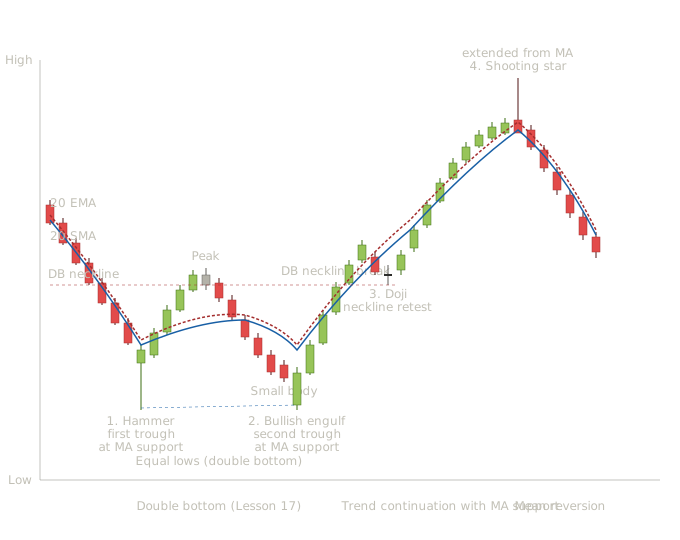
Double bottom with SMA/EMA overlay — Hammer at first trough, Bullish Engulfing at second trough, Doji at neckline retest, Shooting Star at extended distance
This chart shows what your readers should now be able to read systematically: the chart pattern (a double bottom from Lesson 17), the candle patterns (a hammer, a bullish engulfing, a doji, and a shooting star — all from Lessons 1 through 13), and the moving averages (the 20-period SMA and EMA we built in this lesson). Three analytical layers working together, each one confirming or contextualizing what the others reveal.
The downtrend leading in (candles 1-7). Seven bearish candles drive price down with consistent moderate bodies, establishing the prior downtrend. Notice that the moving averages — both SMA and EMA — are sloping downward as they should during a confirmed downtrend. The moving averages are above price during the decline, acting as dynamic resistance. This is the moving average reading habit your readers learned in this lesson applied to the chart's context.
A hammer forms exactly at the rising moving averages. This is the first multi-layer signal: a hammer (Lesson 3) at the structural moment of the double bottom's first trough (Lesson 17) at the dynamic support level the moving averages provide (this lesson). Three independent analytical layers all pointing at the same conclusion simultaneously. Notice what each layer adds. The hammer alone would be a candle signal of uncertain quality — hammers in random price space often fail. The double bottom's first trough alone would be a structural marker, but the trader doesn't yet know it's the first trough (no second trough has formed). The moving average support alone would be a dynamic level being tested, but not every test produces a reversal. The three signals appearing together create a conviction level that no single signal would justify on its own. This is exactly the integration principle from Lesson 29 in practice.
The rally between troughs (candles 9-13). Five bullish candles drive price up toward what becomes the double bottom's neckline. The moving averages are still tracking price but starting to flatten as the downtrend's structure shifts. The EMA is responding faster than the SMA — notice the EMA pulling closer to price than the SMA as the rally develops. This SMA/EMA divergence is exactly what the math you learned earlier in this lesson predicts.
The peak with a small body (candle 14). A small-body candle marks the first rally's high — the level that becomes the double bottom's neckline. The moving averages are now slightly below price, having reversed from acting as resistance during the downtrend to acting as potential support during the recovery. The role reversal we covered in Lesson 15 applies to moving averages as well as horizontal levels.
The decline to the second trough (candles 15-20). Six bearish candles drive price back down to retest the prior low. Notice that the moving averages have started to flatten and even slope down slightly during this decline — they're responding to the renewed bearish pressure. But importantly, the moving averages are now near the prior trough's level, meaning price will test both the prior structural support (the first trough) and the dynamic support (the moving averages) simultaneously.
Small body just before the second trough (candle 21). A small bearish body shows seller exhaustion approaching the support confluence.
A long bullish candle opens below the prior small bearish candle's close and rallies powerfully to engulf its body completely. From Lesson 5, this is the bullish engulfing pattern. From Lesson 17, this is the second trough's confirming reversal candle. From this lesson, this is occurring at moving average support — the dynamic level that confirms structurally meaningful resistance to further decline. Four analytical layers now agree: candle pattern (bullish engulfing), chart pattern position (double bottom second trough), structural support (prior trough level), and dynamic support (moving averages). The conviction level here is exceptional. A trader applying the integrated framework would size this entry meaningfully larger than entries with less confluence.
The rally to the neckline break (candles 23-26). Four bullish candles with progressively larger bodies drive price decisively above the neckline. The breakout candle (candle 26) is a near-marubozu. The double bottom has now completed structurally. The moving averages have reversed their slope and are now sloping upward, confirming the new uptrend's emergence.
After the breakout, price pulls back briefly to test the broken neckline from above. A doji forms at exactly this retest point. From Lesson 2, the doji shows pure indecision at the structural moment. From Lesson 15, this is the role-reversal moment where the broken resistance becomes support. From this lesson, the moving averages are now below price — the dynamic support has shifted to support the new uptrend. The doji here serves a specific analytical function: it confirms the breakout's structural validity. Failed breakouts often show rapid bearish candles immediately after the breakout, while successful breakouts often show indecision followed by continuation. The doji is the equilibrium signal that the breakout is finding genuine support at the retested neckline.
The trend continuation (candles 29-36). Eight bullish candles drive price progressively higher with the moving averages providing dynamic support along the way. The EMA tracks closer to price as the trend strengthens; the SMA stays a bit further below. Both moving averages slope confidently upward.
A shooting star forms when price has traveled far from its moving averages. The candle itself is a recognizable reversal pattern from Lesson 3. The extended distance from the moving averages adds context: when price has moved far from its dynamic support, mean reversion toward that support becomes increasingly likely. This is the moving average reading habit that the candle pattern alone can't provide. A shooting star at normal distance from moving averages is one signal among many. A shooting star at extended distance is signaling that the mean-reversion pressure is now substantial. The combined reading — candle pattern plus extended distance — produces a higher-conviction short signal than either layer alone.
The pullback (candles 38-43). Six bearish candles drive price back down toward the moving averages, exactly as the shooting star's signal predicted. This is mean reversion in action: extended distance from the moving averages, reversal candle at the extreme, decline back toward the dynamic support level. The integrated reading captures the full dynamic where any single analytical layer would miss part of it.
Making Trading Decisions on This Chart in Real Time
Reading a chart after the fact is dramatically easier than reading it in real time. When your readers look at the integrated chart above, they see the complete sequence laid out — the double bottom completed, the breakout confirmed, the extended rally and reversal all visible at once. In real-time trading, none of this is visible. The trader sees the chart developing bar by bar with no knowledge of what comes next. Decisions get made with partial information, in real time, with capital at risk and emotion in play.
This is worth practicing through the chart we just built. Let's walk through what a trader actually applying the integrated reading would have done at each of the four labeled signals, what their conviction level would have been at each moment, what trade decisions they would have made, and importantly, what they couldn't have known at the time. The goal is to show what real-time trading actually looks like — including the parts that don't go perfectly.
What the trader sees at this moment: a clear extended downtrend developing over the prior week or two, price now approaching what appears to be a potential support level (though there's nothing yet to confirm this is structural support), the moving averages sloping down and acting as resistance throughout the decline, and a hammer candle just formed at the bottom of the decline. What the trader does not see: whether this is the actual trough of the move, whether the bullish reversal the hammer suggests will follow through, whether price will instead continue lower in the coming sessions, or whether this becomes the first trough of a double bottom (the structural pattern requires a second trough to complete, which won't form for many more sessions). What conviction level is justified: moderate. The hammer is a recognizable reversal candle at extended downtrend location with the moving averages providing some structural reference. But there's no chart pattern yet — just a candle reversal in a downtrend. A trader who buys here is essentially trading the hammer alone with the moving average context as supporting evidence. A reasonable trade decision: take a small starter position at the hammer's close or on the next day's strength, with a stop just below the hammer's low. The position size should be a fraction of what the trader would commit to a higher-conviction setup because the structural confirmation hasn't arrived yet. Maybe 25-33% of a full position size.
What actually happens after signal 1. The hammer's signal works — price rallies for several sessions, reaching what becomes the first peak between the eventual double bottom's troughs. A trader who entered at the hammer is now in profit. Then price reverses and starts declining again, and over the next several sessions the trader watches their profit erode. By the time price reaches the second trough's level, the trader is approximately back to break-even on their initial entry.
This is the honest reality of trading the hammer alone. The candle signal worked initially, but without the structural confirmation of the broader pattern, the move didn't sustain. The trader who took the small starter position now has a decision to make at the second potential trough.
What the trader sees at this moment: a much more developed structural picture than at signal 1. There's now a clear potential double bottom forming — two troughs at approximately the same level with an intervening peak that defines the neckline. The moving averages have flattened from their earlier downward slope and are now acting as dynamic support near the trough level. A bullish engulfing pattern has just formed at the second trough's bottom. What the trader does not see: whether the double bottom will actually complete with a neckline breakout, or whether price will fail at the neckline and break down through the support level instead. What conviction level is justified: high. Multiple analytical layers now agree — candle pattern (bullish engulfing), chart pattern structure (developing double bottom), structural support (prior trough level), and dynamic support (moving averages). This is the kind of multi-layer confluence that warrants meaningful position sizing. A reasonable trade decision: take the remaining position size that wasn't committed at signal 1, bringing the trader to a full position. Stop placement just below the second trough's low. The trader is now positioned in the double bottom with both technical layers and candle confirmation supporting the trade.
For a trader who didn't take the smaller position at signal 1, this is their actual entry — they waited for higher-conviction confirmation and got it here. Their cost basis is slightly higher than the trader who entered at signal 1, but their conviction is also substantially higher because the structural picture is now clear.
What this teaches about layered entries. Notice that neither approach is wrong. The trader who entered at signal 1 had earlier exposure but lower initial conviction. The trader who waited for signal 2 had higher conviction but worse cost basis. Both can produce good outcomes; both have different risk-reward profiles. Real traders make these choices constantly based on their personal risk tolerance, account size, and methodology. Neither the early entry nor the late entry is objectively better — they reflect different choices about the tradeoff between conviction and price.
What the trader sees at this moment: a strong bullish candle decisively breaking above the neckline resistance. The double bottom has now completed structurally. The moving averages are sloping upward, confirming the trend reversal. Volume is expanding (which the curriculum will cover in later lessons, but is mentioned here for completeness). What conviction level is justified: very high. This is the moment where the chart pattern's structural completion gets confirmed by both the breakout candle and the broader indicator picture. Traders who didn't enter earlier might enter here. Traders who did enter earlier might add to their positions. A reasonable trade decision: for traders already in position from signal 1 or signal 2, this is a moment to confirm the trade is working as expected and let it run. For traders who weren't yet in position, this is a conservative entry point — later than the candle-based entries but with full structural confirmation. The trade-off is the same as before: better confirmation means worse cost basis, but the certainty makes position sizing more comfortable.
What the trader sees at this moment: price has broken above the neckline, rallied briefly, and now pulled back to retest the broken resistance level from above. A doji has formed at exactly this retest, showing indecision at the structural moment. The moving averages are below price, suggesting the new uptrend is holding. What the trader does not see: whether the retest will hold (confirming the breakout) or fail (turning the breakout into a false signal). This isn't really an entry signal — it's a confirmation signal. Traders already in position should see this as validation that the trade is working. Traders who weren't yet in position have one more entry opportunity here: the retest provides a lower-risk entry than the breakout candle itself because the stop can sit just below the retested neckline.
What the trader sees at this moment: substantial sustained uptrend developing over many sessions, price now far from its moving averages (the extended distance), and a shooting star just formed at the rally's high. What the trader does not see: whether this marks the actual top of the move, whether the move will continue higher after a brief pullback, or whether this is the start of a more significant decline. What conviction level is justified for an exit decision: high. The shooting star at extended distance provides clear candle-level signal that mean reversion is becoming likely. For a trader already in position from earlier signals, this is a strong signal to take profits or at minimum tighten stops aggressively. A reasonable trade decision: take partial or full profits. A trader who entered at signal 2 with a full position would be sitting on substantial profit at this point. Exiting at signal 4 captures a meaningful portion of the move without trying to call the exact top.
What actually happens after signal 4. Price declines significantly over the following sessions, exactly as the shooting star at extended distance predicted. The trader who exited at signal 4 keeps their profits. The trader who held through hoping for further upside watches their profits erode.
But here's the honest part. Sometimes after a shooting star at extended distance, price doesn't pull back substantially. It might consolidate briefly and then continue higher. A trader who exits at every shooting star will sometimes leave significant additional gains on the table. The signal isn't a guaranteed top; it's a probabilistic warning that mean reversion has become more likely.
This is where mindset matters most. The trader who exits at signal 4 and then watches price continue higher hasn't made a bad decision — they've made a decision that was correct given the available information at the time. Trying to second-guess that decision based on what happened next is what destroys traders. The shooting star at extended distance was a high-quality exit signal. Sometimes it produces the optimal exit; sometimes it produces a good-but-not-best exit. Either way, taking the signal was the right action because the alternative — ignoring high-quality signals to chase additional gains — leads to giving back profits during the pullbacks that do occur.
The Honest Reality of Trading: Capturing Portions of Moves
The trader in the scenario above made several decisions, none of them perfect, all of them rational given the available information at the time. Let's count what they actually achieved.
If they entered the small starter position at signal 1 (the hammer), they had earlier exposure to the rally but watched it erode before adding at signal 2. If they entered full position only at signal 2 (the bullish engulfing at the second trough), they had a slightly worse cost basis than the absolute low but caught the entire double bottom move plus the trend continuation. If they exited at signal 4 (the shooting star at extended distance), they captured the move from the second trough's recovery through the trend continuation's mature phase but missed any further upside that occurred before the eventual pullback.
What this trader did not do: they did not buy at the exact low (the hammer's actual low). They did not sell at the exact high (the shooting star's actual high). They captured a substantial portion of the available move — likely something like 70-85% depending on exact entry and exit prices — and they did so with manageable risk and high-conviction decision points throughout.
This is what successful trading actually looks like. Not perfect entries and perfect exits, but informed decisions made at moments of confluence between analytical layers, with risk controlled by stop placement, position sizing adjusted to conviction, and profit-taking based on signals rather than greed.
The traders who fail consistently are usually not failing because their analysis is wrong. They're failing because they're trying to optimize for outcomes that can't be optimized for. They want to buy at the exact low and sell at the exact high. They get frustrated when their entries aren't perfect and their exits aren't perfect. They start chasing missed opportunities (entering late after the structural signal already happened, leading to worse risk-reward) and abandoning trades early (selling too soon out of fear, leading to giving up gains the analysis supported holding for). The analysis can be excellent, but the execution mindset destroys the results.
The traders who succeed consistently have made peace with imperfect execution. They accept that they'll sometimes exit too early and miss continued upside. They accept that they'll sometimes enter and then watch the position erode briefly before recovering. They focus on capturing meaningful portions of moves rather than capturing entire moves. They size positions based on conviction levels rather than emotional commitment. And critically, they evaluate their decisions based on the information available at the time of the decision, not based on what happened afterward.
Your readers, as they begin applying the integrated reading to real charts, will benefit from internalizing this mindset early. The analytical framework the curriculum has built is genuinely powerful. It will identify high-conviction setups consistently. But the execution will be imperfect, and that imperfection is not a failure of the framework — it's a feature of trading itself. Accepting this honestly is what allows the framework to actually produce results, because traders who accept imperfect execution can actually execute. Traders who can't accept imperfect execution end up paralyzed or chasing, and neither produces good outcomes regardless of how good the underlying analysis is.
The scenario above describes what would have been a successful sequence of trades. Real trading produces successes and failures both. The trades that fail teach as much or more than the trades that succeed, but only if the trader is honest about evaluating them.
A practical habit that separates traders who improve from traders who plateau: keeping a trade journal. After each completed trade, the trader records what they saw, what they decided, why they decided it, and what actually happened. They specifically record the analytical signals that informed the entry and exit, the conviction level at each decision point, and the actual outcome. Over time, the journal accumulates data about which signal combinations produce reliable results and which don't.
Reviewing the journal periodically reveals patterns. Maybe the trader notices that their hammer entries at moving average support work well but their hammer entries in random price space don't. Maybe they notice that they consistently exit too early on shooting stars at moderate distance but their exits at extended distance work well. The journal makes these patterns visible in a way that memory alone doesn't.
For readers just starting to apply this curriculum's framework, beginning a trade journal from the first trade is invaluable. The journal doesn't need to be elaborate — a simple spreadsheet or notebook with the key information is enough. What matters is the discipline of recording the decision-making honestly and reviewing the accumulated data regularly. Traders who do this consistently improve over time. Traders who don't tend to repeat their mistakes because they can't see the patterns clearly.
Lesson 31 covers the advanced moving average variants — DEMA, TEMA, Hull MA, KAMA, displaced moving averages, and others. Each of these variants modifies the basic SMA or EMA mathematics to address specific limitations. With the SMA and EMA math now understood, your readers will be positioned to understand what each variant is actually doing rather than treating them as mysterious alternative tools. The lessons that follow build through the trend studies, volatility studies, momentum studies, volume studies, and other indicator categories that together form the complete technical analysis toolkit.
Key Takeaways
- A moving average answers: what has the average price been over a recent window of time? The window slides forward with each new bar, producing a continuous line that smooths price action
- SMA: all bars in the window contribute equally — produces more lag but more stability. EMA: recent bars get more weight exponentially — produces less lag but more noise sensitivity
- Key formula: SMA = (P₁ + P₂ + ... + Pₙ) / n. EMA = (Price × K) + (Previous EMA × (1−K)), where K = 2 / (period + 1)
- Moving averages function as dynamic support and resistance — pullbacks to a rising moving average in an uptrend create structural moments where candle reversal patterns become particularly significant
- Extended distance from a moving average signals mean reversion risk — a reversal candle at extended distance carries more weight than the same candle at normal distance
- Moving averages as standalone signals produce poor results (SMA lost to buy-and-hold 88% of the time in major studies). Moving averages as components within multi-factor analysis produce substantially better results
- Successful trading captures 70–85% of moves, not perfect entries and exits. Evaluate decisions based on information available at the time, not what happened afterward
Quiz — 3 Questions
Answer one at a timeA 5-period SMA has values of 10, 11, 12, 11, 13 (oldest to newest). The next bar closes at 15. What is the new 5-period SMA, and what happens to the calculation?
In this lesson
400 — Technical Indicators — Integration and Methodology