From Candles to Chart Patterns — The Conceptual Shift
This lesson is shorter on new vocabulary and longer on framework, because students need to make a conceptual shift before the pattern names start landing.
The Conceptual Shift
Everything we've covered so far has been candle patterns. The unit of analysis was one or two or three sessions, and the question we asked was "what did price do during these specific sessions, and what does that tell us?" Students who've worked through lessons 1–13 are now fluent in reading individual candles and small candle clusters.
Western chart pattern analysis asks a different question. The unit of analysis becomes weeks or months of accumulated price action, and the question shifts to "what shape is price tracing across this longer period, and what does that shape tell us?" The individual candles become less important — sometimes much less important — and the overall contour of price becomes what carries meaning.
This is a conceptual shift worth pausing on, because it changes several habits students have developed:
Candle patterns resolve in 1–5 sessions. Chart patterns typically form over weeks or months on daily charts, or over hours on intraday charts. Students need to develop patience for patterns that take real time to complete and confidence to wait through the formation period without acting prematurely.
Candle pattern analysis barely uses trendlines. Chart pattern analysis is built on them — most chart patterns are defined by the lines you can draw connecting highs and lows, and students who can't draw clean trendlines can't see clean chart patterns. The next lesson is dedicated entirely to this foundation.
A head and shoulders pattern doesn't care what kind of candle formed at the right shoulder peak. The peak itself is what matters. Students who try to label every candle within a chart pattern formation get distracted from the larger structure. The right habit is to zoom out, see the shape, then zoom in only when you need to identify a specific entry or confirmation candle.
Volume in candle pattern analysis is mostly about confirming individual sessions. Volume in chart pattern analysis follows characteristic profiles across the pattern's entire formation — for instance, declining volume during a triangle's formation followed by expanding volume at breakout. Reading volume across the full pattern, not just at single candles, becomes a core skill.
Most chart patterns have a "measured move" calculation — a way of projecting how far price should travel after the pattern completes, based on the pattern's own dimensions. Candle patterns don't generally have this; you wait for confirmation and use other levels for targets. Measured moves are a useful new tool the student gains by moving into chart pattern analysis.
The two analysis systems aren't competing. A skilled trader uses both: chart patterns identify the larger structure (where price is and where it's likely going), candle patterns identify the timing (when to enter or exit within that structure). A bullish engulfing pattern at the right shoulder of a head and shoulders top is a far stronger signal than either pattern alone. The end of this Western section will tie the two systems together explicitly.
Vocabulary for This Lesson
These aren't pattern names yet — they're the conceptual terms students need before specific patterns will land.
| Term | Definition |
|---|---|
| Chart pattern | A recognizable shape traced by price over multiple sessions, usually weeks or months, defined by the lines connecting significant highs and lows. |
| Formation period | The time required for a chart pattern to fully develop. Students need to distinguish patterns that are forming (not yet complete, not yet tradeable) from patterns that are complete (the structural requirements are met, confirmation signal is available). |
| Pivot high / pivot low | A local maximum or minimum in price action. The peaks and troughs that chart patterns are built from. A pivot high is a candle whose high is greater than the highs of the candles immediately before and after it. A pivot low is the mirror. |
| Neckline | A horizontal or sloping line connecting the lows (in a topping pattern) or highs (in a bottoming pattern) that marks the breakdown or breakout level for several reversal patterns. The most famous use is in head and shoulders patterns, but the concept appears across multiple formations. |
| Breakout | Price closing decisively above resistance, signaling that the structure has resolved upward. |
| Breakdown | Price closing decisively below support, signaling that the structure has resolved downward. |
| False breakout / false breakdown | When price crosses a key level briefly and then returns, trapping traders who entered on the apparent break. These are common, costly, and a major focus of the interpretive framework we'll build in lesson 23. |
| Measured move | A target projection calculated from the chart pattern's own dimensions. The classic example: in a head and shoulders top, the measured move equals the distance from the head's peak to the neckline, projected downward from the neckline breakdown point. Different patterns have different measured-move calculations, but the principle is consistent. |
| Pattern failure | When a complete chart pattern produces a breakout in the expected direction that doesn't follow through, or breaks in the opposite direction entirely. Studying failures is as important as studying successes, because a failed head and shoulders top often produces a strong rally — knowing when a pattern has failed and how to respond is a skill students need. |
A Diagram of the Conceptual Shift
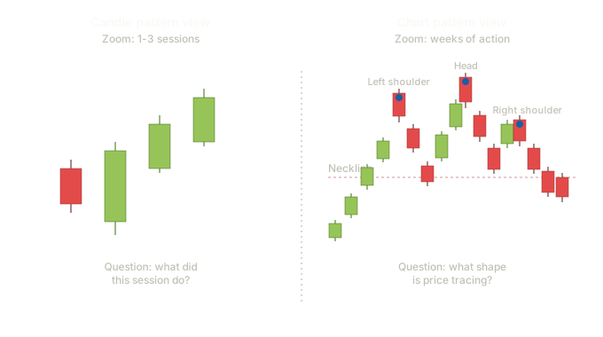
The left panel shows what students have been doing: zooming in tight on individual candles, asking what each one means. The right panel shows what they'll now learn to do: zooming out, ignoring the candle-level detail, and seeing the larger shape that price has traced over weeks of trading. The same data, two different levels of abstraction.
Students don't abandon candle-level analysis when they learn chart patterns. They add a level of abstraction on top of it. A skilled trader can zoom out to see the head and shoulders, then zoom back in to find the specific candle signal that times the entry. Both views matter; both views serve different decisions.
How This Lesson Connects to What Comes Next
Lesson 15 builds the foundation that all subsequent chart pattern lessons depend on: support and resistance, trendlines, channels. Without that foundation, the pattern names in lessons 16–22 don't have anchors. Students who try to skip lesson 15 because it feels too elementary tend to misidentify patterns in lessons 16–18 because they can't draw the lines that define those patterns.
Lessons 16–18 cover reversal patterns. Lessons 19–21 cover continuation patterns. Lesson 22 covers patterns that don't fit cleanly into either category. Lesson 23 is the interpretation framework for chart patterns, parallel to lesson 12 for candles. Lesson 24 is the synthesis lesson where candle and chart analysis come together.
The same format we've used throughout: vocabulary first, then chart examples with patterns in market context, then the four-column reference (confirmation rule, volume signature, qualitative reliability, common failure mode) with cited statistics from public sources.
The statistical literature on chart patterns is dominated by Bulkowski's Encyclopedia of Chart Patterns — same author, separate book from the candlestick encyclopedia. The same approach applies as before. His specific testing figures are his research output and we point students to his site for the data directly. Other sources — academic papers, independent backtests, charting platforms — provide the multi-source pool that lets students triangulate without relying on any single researcher's compiled results.
Timeframe Universality
Everything in this Western analysis section applies across all timeframes. A head and shoulders pattern on a daily chart takes weeks to form. The same head and shoulders pattern on a one-minute chart takes about an hour. The pattern, the structural rules, the neckline, the measured move, the volume signature — all of it works identically. What changes is the clock, not the logic.
This is the same principle that already applied to the candle patterns in lessons 1–13. A hammer on a daily chart represents one day of trading. A hammer on a five-minute chart represents five minutes of trading. The pattern is the same shape, encodes the same buyer-versus-seller story, and follows the same interpretive rules. The session's duration is just whatever interval the chart is set to.
A day trader watching a one-minute or five-minute chart sees morning stars, engulfing patterns, hammers, doji families, head and shoulders formations, double tops, triangles, and flags — all of them. The names don't change. The interpretive logic doesn't change. The only thing that changes is how quickly the pattern forms and how quickly the trade resolves.
On a tick chart or a 15-second chart, the same patterns appear and behave the same way. A scalper trading the open will see hammers form in minutes that a swing trader sees form over days. Same shape, same meaning, much shorter clock.
A head and shoulders top on a monthly chart takes years to form. When it completes, the measured-move target is correspondingly larger and the trade horizon is correspondingly longer. Same pattern, same rules, far slower clock.
The Reliability Question Across Timeframes
This is where students need a calibrated expectation. Patterns are generally regarded as more reliable on higher timeframes than on lower ones. The reason is signal-to-noise: a one-minute candle reflects whatever happened to bid and ask in a 60-second window, which can be moved significantly by a single large order or a moment of random volatility. A daily candle reflects an entire session of trading, including the cumulative behavior of all participants who acted that day. The daily candle is harder to push around by noise; it represents real consensus rather than transient pressure.
This applies to chart patterns too. A head and shoulders on a daily chart represents weeks of accumulated buyer-seller conflict and the eventual capitulation of buyers. A head and shoulders on a one-minute chart represents an hour of the same dynamic, but at a scale where institutional algorithms, news ticks, and individual large orders can produce or destroy the pattern through noise rather than meaning.
The practical implication for students:
A daily-chart head and shoulders that completes is a meaningful event. You may see one per stock per year, perhaps less.
A one-minute head and shoulders may complete several times in a single trading session. Most won't follow through cleanly. The trader is making up in frequency what they lose in reliability.
The discipline that serious traders develop is to use higher timeframes to establish bias and context, then drop to lower timeframes for entry timing. A one-minute hammer is far more reliable when it forms at the daily-chart support level you identified yesterday. The chart patterns on the daily provide the structure; the candle patterns on the one-minute provide the timing.
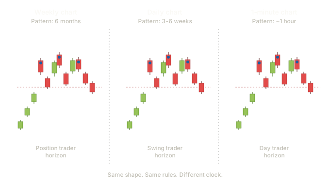
The three panels show the identical head and shoulders shape — left shoulder, head, right shoulder, neckline — at three different timescales. The position trader on the left sees this formation develop over six months. The swing trader in the middle sees the same formation develop over three to six weeks. The day trader on the right sees the same formation develop in about an hour. The geometry is identical; only the clock changes.
Pedagogical Implications
This timeframe universality has practical consequences for how you teach the rest of the Western section:
When we cover the head and shoulders pattern in Lesson 16, we'll show it on a daily chart for clarity, but every student should leave the lesson knowing that the same pattern works identically on a five-minute chart for a day trader and a weekly chart for a position trader.
A student who looks at one head and shoulders per week on a daily chart needs years to develop pattern fluency. A student who looks at the same pattern on lower timeframes sees several formations per week, and pattern recognition becomes much faster — though they need to discount accordingly for the noise.
A daily-chart head and shoulders identifying the larger structure, combined with a five-minute hammer at the neckline retest timing the entry, is the kind of multi-timeframe approach serious traders actually use. Students who understand both candle patterns and chart patterns at multiple timeframes can construct this kind of analysis themselves.
Everything we covered in Lessons 1–13 applies directly to their workflow. A morning star on a five-minute chart at premarket support is the same signal a swing trader gets from a morning star on a daily chart at quarterly support. The interpretive framework — location, magnitude, confluence, confirmation — applies identically. The clock is faster, the noise is higher, but the analysis system is the same one they've already learned.
Key Takeaways
- First, the shift from candle-level analysis to chart-level analysis — zooming out to see shapes that take many sessions to trace, with trendlines as the primary tool, individual candles fading into the background, and measured-move targets becoming available.
- Second, the timeframe universality principle — the same patterns work identically across all timeframes, with higher timeframes offering more reliability and lower timeframes offering more frequency. Multi-timeframe analysis combines both strengths and is what serious traders actually do.
- Both shifts matter. A student who only understands the first thinks chart patterns are for long-term traders. A student who only understands the second thinks all patterns are equally tradeable at any timeframe. Together they give a calibrated view of how the tools actually work.
Quiz — 3 Questions
Answer one at a timeA student trained in candle pattern analysis starts studying chart patterns. Which habit from candle analysis does chart pattern analysis require them to change most fundamentally?
In this lesson
300 — Western Chart Patterns — Structure, Candle Integration, Statistics