Support, Resistance, and Trendlines — The Foundation
The lesson covers three foundational concepts plus the supporting vocabulary needed before we start naming chart patterns in Lesson 16.
The Foundation
This is the foundation lesson, and it deserves the time. Every chart pattern from here on is built from the elements we cover today. A student who can draw clean support lines, resistance lines, and trendlines will see chart patterns clearly. A student who can't will misidentify them constantly, even when the underlying knowledge is correct, because they can't anchor what they're seeing to specific price levels.
The lesson covers three foundational concepts plus the supporting vocabulary needed before we start naming chart patterns in Lesson 16.
Vocabulary
| Term | Definition |
|---|---|
| Support | A price level where buying interest has historically emerged and stopped declines. When price falls toward a support level, demand tends to increase as buyers see value, and selling tends to decrease as holders are unwilling to sell at perceived lows. Support is identified by previous lows that have been respected — points where price fell, paused, and reversed upward. |
| Resistance | The mirror concept. A price level where selling interest has historically emerged and stopped advances. When price rises toward resistance, supply increases as holders take profits and short sellers initiate positions, and buying decreases as buyers become reluctant to chase. Resistance is identified by previous highs that have been respected — points where price rose, paused, and reversed downward. |
| Role reversal | The principle that broken support becomes resistance, and broken resistance becomes support. When price breaks decisively below a support level, that level often acts as resistance on future rallies because traders who bought near the level (and are now underwater) sell when price returns to their breakeven. When price breaks decisively above resistance, the level becomes support on future pullbacks because traders who missed the breakout buy on the retest. |
| Horizontal support / horizontal resistance | A support or resistance level that runs flat across the chart at a specific price. Drawn as a horizontal line connecting multiple pivot lows (for support) or pivot highs (for resistance). |
| Trendline | A diagonal line that connects a series of higher lows (in an uptrend) or lower highs (in a downtrend). The trendline traces the rising or falling boundary of the trend itself. |
| Uptrend line | A trendline drawn under price action, connecting at least two higher lows. The line slopes upward and acts as dynamic support — price bouncing off the trendline confirms the uptrend's continuation; price breaking below the trendline signals the uptrend may be ending. |
| Downtrend line | A trendline drawn over price action, connecting at least two lower highs. The line slopes downward and acts as dynamic resistance. |
| Channel | A pair of parallel trendlines containing price action between them. An ascending channel has an uptrend line as the lower boundary and a parallel line above touching the highs. A descending channel is the mirror. |
| Pivot high / pivot low | Already introduced in Lesson 14, but repeated here because they're the anchor points for every line we draw. A pivot high is a peak where price reversed downward. A pivot low is a trough where price reversed upward. |
| Touch | A point where price reaches a support, resistance, or trendline level and reverses without breaking it. More touches generally strengthen the level's significance because they confirm the level continues to matter to market participants. |
| Break | When price crosses through a level decisively, typically requiring a close beyond the level rather than just an intraday wick through it. |
| Retest | After a break, price often returns to test the broken level from the other side. A break followed by a successful retest (where price respects the level in its new role) is one of the highest-probability setups in technical analysis. |
Drawing Horizontal Support and Resistance
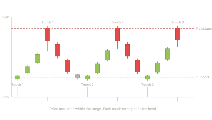
This is a classic range-bound price action chart. Price oscillates between a horizontal resistance level at the top (marked in red) and a horizontal support level at the bottom (marked in blue). Three touches at each level confirm both levels are real — buyers consistently emerge at support, sellers consistently emerge at resistance.
What students should notice: The level itself isn't a precise single price — it's a zone. Look at the three resistance touches: each one comes to almost the same price but not exactly. The line is drawn at the approximate level where price has rejected multiple times, not at the precise tick of any single rejection. This is normal and correct. Students who try to draw lines that touch every wick exactly will give up in frustration. The line approximates the level; price respects the zone. Each subsequent touch strengthens the level's significance. A level with one touch is a possibility. A level with two touches is a level. A level with three or more touches is a well-established level that market participants are clearly watching. By the third touch, traders worldwide are placing orders near that price, which creates a self-reinforcing dynamic — the level matters because traders treat it as if it matters.
When a student first opens a chart, the most useful drawing they can do is identify the major horizontal support and resistance levels. These levels do more than identify pattern boundaries — they identify where reversal patterns are likely to form (at support and resistance) and where continuation patterns are likely to break out from (when support and resistance give way).
Drawing Trendlines
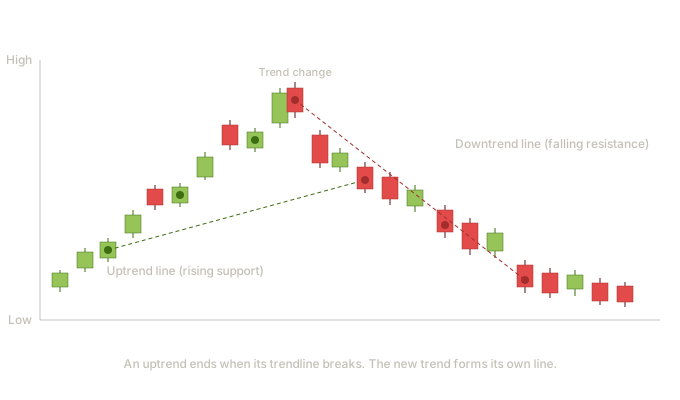
This chart shows the rhythm of trend changes. Price advances along an uptrend line for an extended period — each pullback finds support on the rising green line, with four distinct touches confirming the line's significance. Then the trend changes. After making a final high, price begins making lower highs, and a new downtrend line emerges connecting those lower highs.
What students should notice about drawing uptrend lines: An uptrend line is drawn under price action, connecting the pivot lows (the troughs where pullbacks ended). Notice the four green dots — these are the anchor points the line connects. The line slopes upward because each successive pullback bottomed at a higher price than the previous one. That's the structural definition of an uptrend: higher highs and higher lows. The minimum requirement is two touches to draw a tentative trendline. The third touch confirms the line — this is when you know other market participants are also watching it. Each additional touch strengthens the line's significance. What students should notice about drawing downtrend lines: A downtrend line is drawn over price action, connecting the pivot highs (the peaks where rallies ended). The four red dots mark these anchors. The line slopes downward because each rally peaked at a lower price than the previous one — the structural definition of a downtrend. The trend change moment: Look at the peak where the uptrend ends. Price has been making higher highs and higher lows for the entire left half of the chart. At the peak, that pattern breaks — price makes a high, then fails to make a higher high on the next rally, then breaks below the uptrend line entirely. The combination of failing to make a new high plus breaking the trendline is what signals the trend has changed. Either event alone is suggestive; both together is confirmation.
They're not just lines — they're statements about who's winning. An intact uptrend line means buyers keep stepping in at higher prices. A broken uptrend line means buyers have stopped stepping in, and the structural integrity of the trend is now in question.
Students often force trendlines to fit by ignoring touches that don't quite work. If a line "almost" touches three points but the third point is meaningfully off, the line isn't real — students need to redraw it. Trendlines that require ignoring evidence to maintain are wishful thinking. Students often draw trendlines using wicks instead of bodies, or bodies instead of wicks, inconsistently. Pick one approach and stick with it for any given chart. Most traders use wicks for trendlines because wicks represent the extreme of price action during each session, which is the boundary the trend is defending. Students often draw too many trendlines. A useful chart usually has three or four meaningful lines — major support, major resistance, the active trendline. A chart with twelve lines isn't analysis; it's clutter. The discipline is to identify only the lines that genuinely matter.
Channels — Parallel Structure in Trends
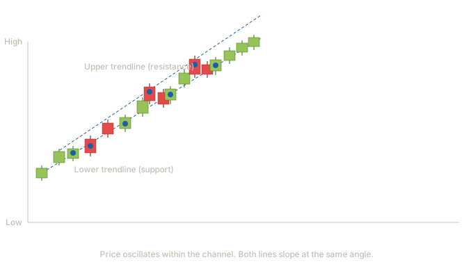
A channel is what happens when a trendline gets a parallel partner. In this ascending channel, the lower trendline connects the pivot lows of the uptrend (acting as dynamic support), and a parallel line drawn at the same angle connects the pivot highs (acting as dynamic resistance). Price oscillates between the two boundaries as the trend advances.
What students should notice: The two lines slope at the same angle. That parallelism is the structural feature that defines a channel. When you draw the lower trendline first and then attempt to draw a parallel line touching the highs, if that upper line cleanly contains the price action, you have a channel. If price routinely violates the upper line, or the upper line doesn't touch any meaningful highs, you don't have a channel — you have a trendline with random highs above it. Channels give students two pieces of information at once. The lower trendline tells you where pullbacks should bottom (entries on the long side). The upper trendline tells you where rallies should top (profit-taking or short-entries for traders willing to fade strength within a trend). A channel break is more significant than a trendline break. When price breaks below an ascending channel's lower boundary, it's signaling that the buyer rhythm that sustained the entire trend has broken down. When price breaks above an ascending channel's upper boundary, it often signals a blow-off acceleration — a move so strong it exceeds the prior pace, which can either continue dramatically or fail dramatically. Acceleration breakouts above channels deserve careful watching.
Channels are particularly useful for swing traders and position traders who want to enter on pullbacks within a trend. Rather than trying to time exact bottoms, the student waits for price to approach the lower channel line, then looks for a candle pattern (hammer, bullish engulfing, morning star) at that level to time the entry. This is the multi-timeframe synthesis we'll formalize in Lesson 24, applied at the trendline level.
Role Reversal — Broken Support Becomes Resistance
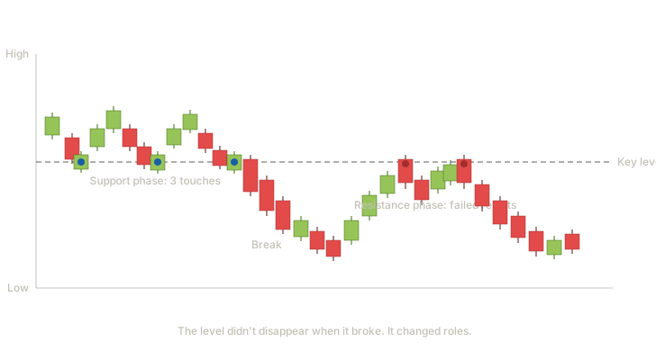
This chart illustrates one of the most important concepts in technical analysis: a price level doesn't disappear when it breaks — it switches sides. The gray dashed line marks a single price level that plays two distinct roles across the chart.
Support phase (left half). Three blue dots mark touches where price fell to the level and bounced. Buyers consistently emerged at this price, defending it through three separate tests. This is classical support behavior, identical to what we covered earlier in the lesson. The breakdown. Eventually, sellers overwhelm buyers and price breaks decisively below the level. This is the moment where support has failed — buyers who were defending the level have either given up, sold out, or run out of capital. The level no longer acts as a floor. Resistance phase (right half). Price continues lower, then rallies back toward the level from below. The red dots mark two failed retests — price approaches the level, fails to break through it, and reverses downward. The same level that previously acted as support is now acting as resistance. The line hasn't moved; only price's relationship to it has flipped.
When price was at support, holders bought there because they thought it was a good price. When the level broke and price fell, those buyers became underwater — they own at the support level, but the market is now below it. Many of these holders make a quiet promise: "if it ever gets back to where I bought, I'm getting out." When price rallies back to the level, that wave of breakeven selling appears, and the level rejects price from below. The same psychology that previously made the level support now makes it resistance. The mirror also applies: broken resistance becomes support. Buyers who missed a breakout often promise themselves they'll buy on the retest. When price returns to the broken resistance level, that wave of patient buying emerges, and the level holds as support.
Role reversal is one of the most reliable concepts in technical analysis because it's grounded in observable trader psychology, not just chart geometry. Students should specifically watch for retests of recently broken levels — these are among the highest-probability setups in the entire technical analysis toolkit. A broken support that gets retested from below, with a bearish reversal candle pattern forming at the retest, is the kind of setup that combines chart pattern context with candle pattern timing — exactly the synthesis we'll formalize in Lesson 24.
Statistical Perspective on Support, Resistance, and Trendlines
Unlike named chart patterns, support and resistance levels don't have a single "success rate" in the way patterns do. They're concepts that other patterns are built from, and their reliability is measured indirectly through the patterns that incorporate them. That said, several principles have research support:
- Multiple touches strengthen levels. Research broadly supports the conventional wisdom that levels touched three or more times are more reliable than levels touched once or twice. This appears across multiple technical analysis textbooks and is consistent with academic studies on support and resistance.
- Round numbers act as psychological levels. Prices ending in major round numbers (whole dollars, ten-dollar increments, hundred-dollar increments) tend to attract more order activity than non-round prices. This is well-documented in market microstructure research and is a useful overlay when identifying levels.
- Recent levels matter more than older ones. A support level established three months ago is generally more relevant than one established three years ago because more current market participants are aware of it and price has had less opportunity to invalidate it.
- Volume at the level matters. Levels that formed on heavy volume are generally more reliable than levels formed on thin trading. The volume signature tells you whether real participation defended the level or whether the level was a quiet coincidence.
Edwards and Magee's Technical Analysis of Stock Trends — the foundational text where most of these concepts were codified. Multiple editions; the original work is from 1948. Bulkowski's Encyclopedia of Chart Patterns and his pattern site (thepatternsite.com) — extensive research on chart patterns that build on support and resistance. Academic literature via Google Scholar — search for "support resistance technical analysis" or "psychological price levels." Researchers including Osler, Lo, and Hasanhodzic have published peer-reviewed work on these concepts. Market microstructure research on round-number clustering — search terms include "price clustering" and "round-number effect."
Common Mistakes Students Make with Line Drawing
A few patterns of error worth covering explicitly in the lesson, because they're predictable and addressable:
- Drawing lines through too many wicks. Wicks represent intraday excursions that may not reflect the true level. Students often draw lines that catch every single wick, which forces the line into positions that don't reflect the underlying psychological level. The discipline is to draw the line at the price most touches converge to, not at the extreme of any single wick.
- Treating lines as exact prices instead of zones. Support and resistance are zones, typically a few ticks wide, not single prices. Price touching $99.97 when the level is $100 is still respecting the level. Students who treat lines as razor-precise miss valid touches and force themselves into overly tight analysis.
- Forgetting to check higher timeframes. A level visible on a 15-minute chart may be invisible on a daily chart and vice versa. Important levels typically appear across multiple timeframes — a daily-chart resistance level should also be visible (and respected) on the 4-hour and 1-hour charts. Students should habitually check higher timeframes before committing to a level's significance.
- Drawing lines and never updating them. Markets evolve. A support level from six months ago may have been broken, retested, and faded into irrelevance without the student noticing. Charts should be re-marked regularly, not treated as permanent reference documents.
- Treating trendline angle as fixed. Trendlines have a "best fit" angle that may shift slightly as new pivots form. Students often anchor too rigidly to the first version of a line they drew and miss the evolution. Trendlines are working tools — they get adjusted as new information arrives.
How This Lesson Sets Up Lessons 16 Through 22
Every named chart pattern we cover from here on is built from the elements in this lesson. To make that concrete:
- Head and shoulders (Lesson 16) has a neckline — a horizontal or sloping support line — that defines the pattern's breakdown level.
- Double tops and bottoms (Lesson 17) have horizontal resistance and support that define the pattern's structure, with a neckline that confirms the reversal.
- Rounding tops and bottoms (Lesson 18) are bowl-shaped curves that students still need horizontal levels to identify the breakout from.
- Triangles (Lesson 19) are defined by two converging trendlines — one rising, one falling, or one horizontal and one angled. Without trendline-drawing skill, triangles are invisible.
- Flags and pennants (Lesson 20) are short trendline channels following sharp moves. The trendline angle of the consolidation defines the pattern.
- Rectangles (Lesson 21) are horizontal channels between parallel support and resistance.
- Wedges (Lesson 21) are converging trendlines that both slope in the same direction.
- Cup and handle (Lesson 22) is a rounding bottom plus a small flag-like handle, both requiring line-drawing to identify.
Students who internalize this lesson find every subsequent pattern lesson much easier. Students who try to skip it because it feels too elementary discover in Lesson 19 that they can't identify triangles cleanly, which means they can't trade them confidently.
have students mark up five recent charts on their own, drawing only the major support levels, resistance levels, and trendlines they consider significant. No pattern naming yet — just line drawing. Then have them compare their charts with each other or with a worked example. The disagreements about which lines matter and where to draw them are where real learning happens.
Quiz — 3 Questions
Answer one at a timePrice has respected a support level three times over several months, then breaks decisively below it. A week later, price rallies back to that same level from below and reverses downward. What is the correct interpretation of the level's second role, and why does it behave this way?
In this lesson
300 — Western Chart Patterns — Structure, Candle Integration, Statistics